
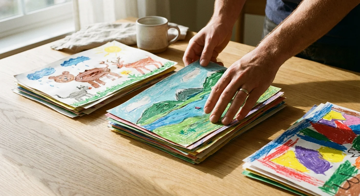
Every parent knows the quiet guilt of staring at a growing mountain of finger paintings, macaroni collages, and glitter-covered construction paper. These items represent your child’s developmental milestones and creative spark; however, the sheer volume can quickly overwhelm your living space. Physical art is fragile. Over time, construction paper fades, tape loses its grip, and the edges of precious drawings begin to curl and tear. You want to honor these memories without turning your home into a warehouse.
Establishing a comprehensive home photo archive using best practices is the first step toward reclaiming your living space from overwhelming boxes of paper.
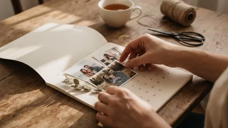
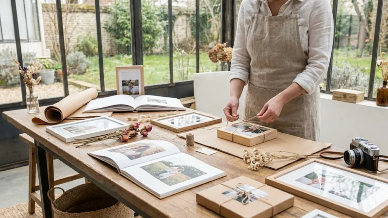
The solution lies in the transition from physical clutter to a curated, professional photo book. By learning how to digitize kids art properly, you create a permanent archive that takes up inches on a bookshelf rather than boxes in the attic. This guide provides a comprehensive roadmap for selecting, photographing, and designing a high-end art book that celebrates your child’s journey from first scribbles to detailed masterpieces.
The Art of Curating Your Child’s Collection
The most significant hurdle in this process is often emotional rather than technical. You cannot possibly preserve every single scrap of paper your child touches. To create a professional-grade photo book, you must act as a museum curator. This means making difficult decisions about what truly represents your child’s growth and personality.
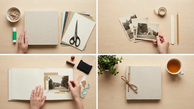
Begin by gathering all the artwork from a specific timeframe—usually a single school year or a developmental stage like “The Toddler Years.” Sort the pile into three distinct categories: The Masterpieces, The Milestones, and The Process. The Masterpieces are those stand-out works that look beautiful or show significant talent. The Milestones are pieces that represent a “first,” such as the first time they wrote their name or drew a recognizable person. The Process pieces are the everyday sketches that, while sweet, are repetitive. Your goal is to keep 10% to 20% of the total volume for the book.
Consider the story you want to tell. A professional book focuses on quality over quantity. If you include fifty nearly identical drawings of a sun, the impact of each one diminishes. Instead, choose the best example of that sun from the beginning, middle, and end of the year to show progression. This curation phase ensures that when you open the finished book, you see a highlight reel of your child’s creativity rather than a chaotic dump of every project they ever completed.
Technical Essentials for Digitizing Art
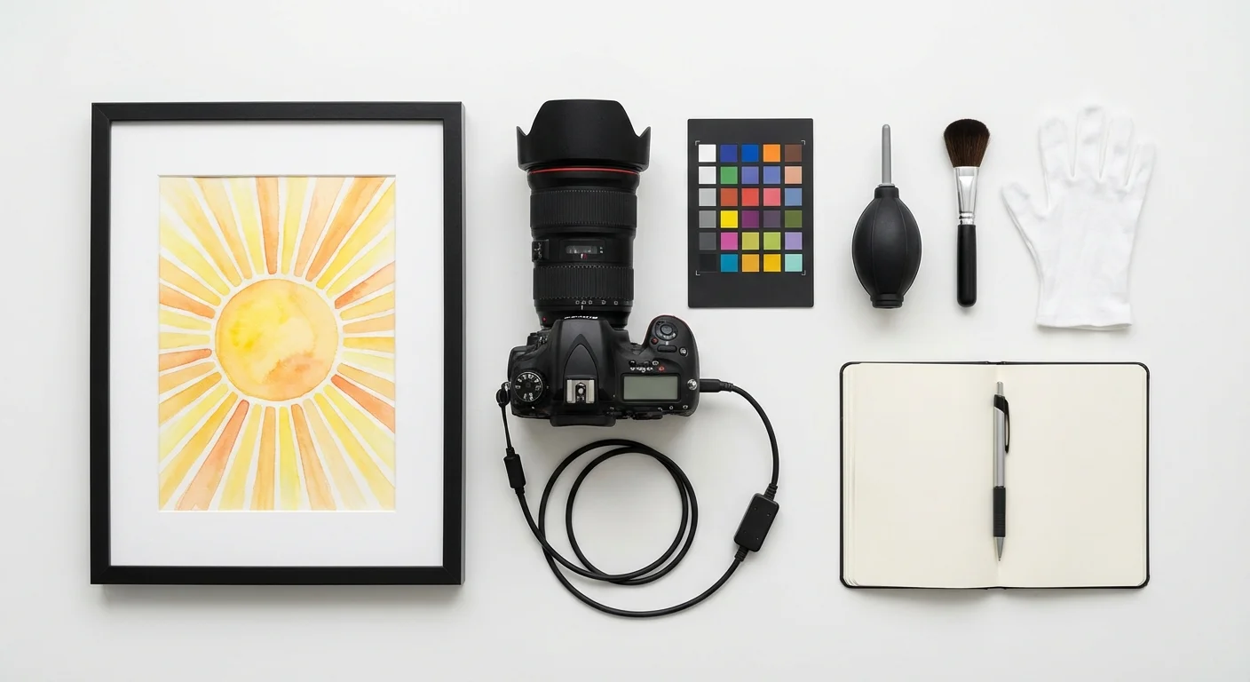
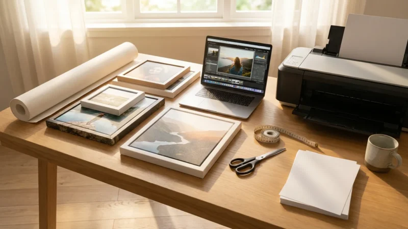
To preserve school projects and drawings with professional clarity, you need a high-quality digital file. You have two primary options: scanning or photography. Each method has its strengths depending on the medium of the art. Scanners are excellent for flat, standard-sized drawings, while photography is necessary for 3D projects or oversized paintings.
When using a scanner, settings matter immensely. Set your resolution to at least 300 DPI for standard printing. If you think you might want to enlarge a specific piece to a full-page spread or even wall art later, scan at 600 DPI. Always save your files as TIFF or high-quality JPEG formats. TIFF is a “lossless” format, meaning it retains all the data and color depth, which is ideal for long-term preservation. You can learn more about file formats and digital image quality at Digital Photography Review to ensure you are using the best settings for your specific hardware.
For 3D objects—like clay sculptures, LEGO builds, or dioramas—photography is your only choice. Use a camera with a decent sensor rather than a budget smartphone if possible. You want to capture the texture of the materials, whether it is the ridges in a popsicle stick house or the thick impasto of acrylic paint. If you use a smartphone, ensure you are in a high-light environment to avoid the “graininess” that occurs when sensors struggle in the dark.

Setting Up Your At-Home Photography Studio
Lighting is the single most important factor in how professional your final book will look. Bad lighting leads to shadows, yellow tints, and glare that obscures the art. You do not need expensive studio lights; you simply need to understand how to use natural light to your advantage.
Find a large window that faces north or south. This provides “indirect” light, which is soft and even. Avoid direct sunlight, as it creates harsh shadows and can “blow out” the colors, making them look white and washed out. Place a table or a piece of white foam board on the floor near the window. Secure your art to the surface using a small piece of painter’s tape on the back to keep it flat. Position yourself so you are not casting a shadow over the work. If the light is coming from the left, you can place a white poster board on the right side to reflect some of that light back onto the art, filling in any soft shadows.
“Consistent lighting is the bridge between a simple snapshot and a professional archive. When the light is even, the colors of the artwork remain true to the child’s original intent.”
If you are photographing many pieces, consistency is key. Set up your tripod once and mark the spot for the artwork on your table. This allows you to swap pieces in and out quickly while maintaining the same distance and angle. This uniformity makes the layout process much easier because all your images will have a similar “feel” and resolution.
Editing Images for Professional Results
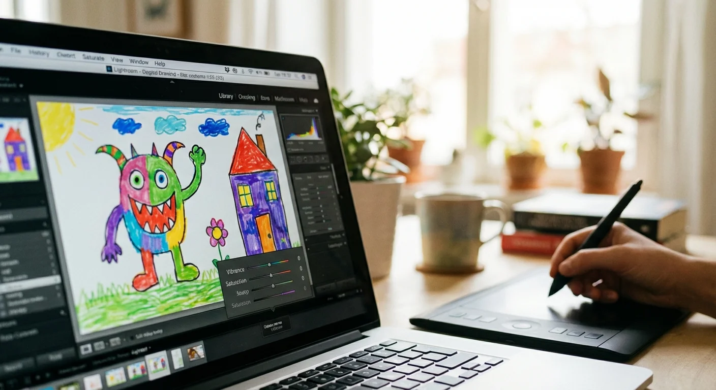
Even the best photo needs a little help in post-processing. Your goal isn’t to change the art, but to make the digital version look exactly like the physical piece. Often, white paper looks slightly grey or blue in photos. You can fix this with a few simple adjustments in any basic photo editing software.
First, use the “Crop” tool to remove the edges of the table or the tape you used to hold the paper down. Leave a small, uniform margin of the original paper edges if you want a “gallery” look, or crop right to the edge of the artwork for a modern, full-bleed appearance. Next, adjust the “White Balance.” Most editors have a “dropper” tool—click it on a part of the paper that should be white, and the software will automatically remove any yellow or blue color casts.
Pay close attention to “Contrast” and “Saturation.” You want the pencil marks to be dark enough to read and the colors to pop just as they do in real life. However, be careful not to over-saturate; neon markers can quickly become “neon blobs” if you push the settings too far. If the artwork is on colored construction paper, ensure the background color in the photo matches the physical paper as closely as possible. Consistent editing creates a cohesive look that ties the entire book together, even if the art was created months apart.
Designing a Cohesive and Visual Layout
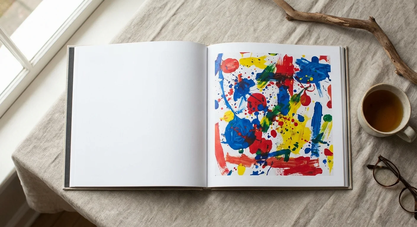
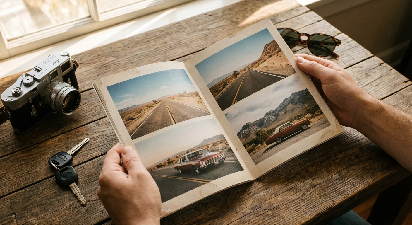
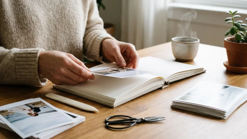
When you start designing your children’s art photo book, think like a book designer. Resist the urge to cram five images onto every page. White space is your friend. It allows the viewer’s eye to rest and focuses all the attention on the art itself. A professional layout often features one primary piece of art on the right-hand page, with a smaller, related sketch or a detail shot on the left-hand page.
Grouping pieces by color or theme can create a beautiful visual flow. If your child had a “blue phase” where they only drew whales and oceans, group those together. This creates a more sophisticated aesthetic than a strictly chronological approach. You can also vary the scale. Dedicate a full-page spread to a particularly detailed painting, then follow it with a grid of four smaller “doodles” or practice sketches. This rhythm keeps the reader engaged as they flip through the pages.
| Layout Style | Best Used For | Visual Impact |
|---|---|---|
| Full Bleed | High-detail paintings and large-scale projects. | Immersive, dramatic, and modern. |
| Thematic Grid | Small sketches, doodles, or a series of similar subjects. | Shows volume and variety without clutter. |
| The “Gallery” Look | Formal pieces or those with significant margins. | Clean, sophisticated, and mimics an art show. |
| Before & After | Early scribbles vs. later refined drawings. | Emphasizes developmental growth and skill. |
Avoid using “busy” digital backgrounds or clip art provided by photo book software. These often look dated and distract from your child’s work. Stick to solid white, light grey, or black backgrounds. This “clean” approach ensures the book remains timeless and looks like a professional art monograph you would find in a museum gift shop.
Adding Narrative and Context to Your Photo Book
While the art is the star, the context is what makes the book a family heirloom. Ten years from now, you might not remember why your child drew a purple elephant with three tails. Including small notes, quotes, and data points adds layers of meaning to the collection.
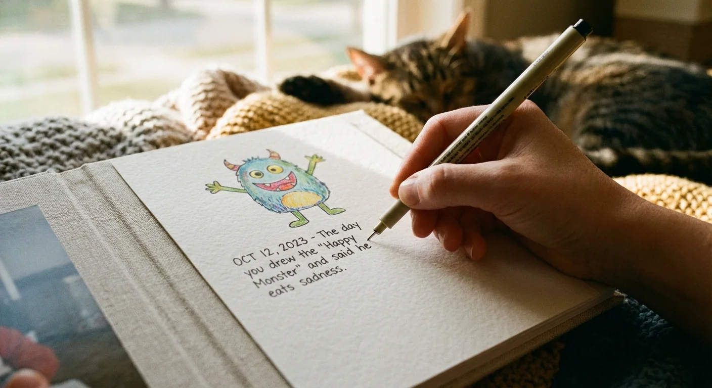
Incorporate “Artist Quotes.” If your child tells you a story about what is happening in the drawing, write it down immediately. Use a clean, simple font to place these quotes near the relevant artwork. You can also include a small “Artist Profile” at the beginning of the book with a photo of your child holding their favorite brush or wearing a paint-stained smock. This grounds the artwork in a specific time and place.
Don’t forget the logistical details. Include the date (or at least the year and season), the child’s age, and the medium used (e.g., “Watercolors on recycled cardboard”). These details help track their developmental milestones. For example, noting that a complex drawing was done at age four provides a much different perspective than seeing the same drawing at age seven. You are documenting the evolution of a human being, not just a collection of images.

Printing Specifications and Archiving the Originals
The final step is choosing the right physical format for your book. For a professional look, choose a hardbound book with a “lay-flat” binding. Lay-flat books use a specific binding technique that allows the pages to stay perfectly flat when opened, which is essential for viewing art that spans across two pages. It prevents the center of the image from getting lost in the “gutter” of the book.
For paper choice, a matte or lustre finish is generally superior to glossy for artwork. Glossy pages can cause glare and show fingerprints, which distracts from the textures you worked so hard to capture. A heavy-weight archival paper will ensure the book lasts for generations. You should also consider the color accuracy of the printer. While most consumer-grade photo book companies are excellent, look for those that offer “pro” color profiles if you are particularly concerned about the fidelity of your child’s color choices.
Once your book is printed, you can confidently address the physical pile. You don’t have to throw everything away, but you can be much more selective. Keep the absolute best pieces—the “soul” of the collection—and store them properly. Use acid-free, lignin-free folders and boxes to prevent chemical degradation. The Image Permanence Institute provides extensive research on how environmental factors like humidity and light affect the lifespan of paper and pigments. By storing the best physical pieces and having the rest preserved in a beautiful book, you have achieved the perfect balance of preservation and organization.
“A photo book doesn’t just store art; it validates the child’s effort. When a child sees their work bound in a ‘real’ book, it sends a powerful message that their creativity is valued and respected.”
By following this system, you transform a source of household stress into a source of pride. You move from “managing clutter” to “preserving a legacy.” These books will eventually become some of your most prized possessions, offering a tangible link to the fleeting, magical years of your child’s early imagination.
Frequently Asked Questions
What is the best resolution for digitizing children’s art?
You should aim for at least 300 DPI (dots per inch) for standard printing. If you plan to enlarge the artwork or want to capture fine details like crayon texture, 600 DPI is a safer choice for high-quality archival results.
How do I photograph art that is too large for a scanner?
Set up a flat-lay station in a room with plenty of natural, indirect light. Use a tripod to position your camera directly above the art, ensuring the lens is parallel to the floor to avoid perspective distortion. Use a self-timer or remote shutter to eliminate camera shake.
Should I keep the original artwork after making a photo book?
While the photo book preserves the memory, you should keep the ‘milestone’ pieces. Store these in acid-free, archival folders to prevent yellowing and brittle paper over time. For high-volume everyday sketches, the digital version usually suffices.
What type of paper is best for a children’s art photo book?
Lustre or matte paper finishes work best. They reduce glare and resist fingerprints, allowing the colors of the artwork to appear vibrant and true to the original medium without the distracting shine of glossy paper.
Disclaimer: This article is for informational purposes only. When handling valuable or irreplaceable photographs, consider consulting a professional conservator. Always test preservation methods on non-valuable items first.


Leave a Reply