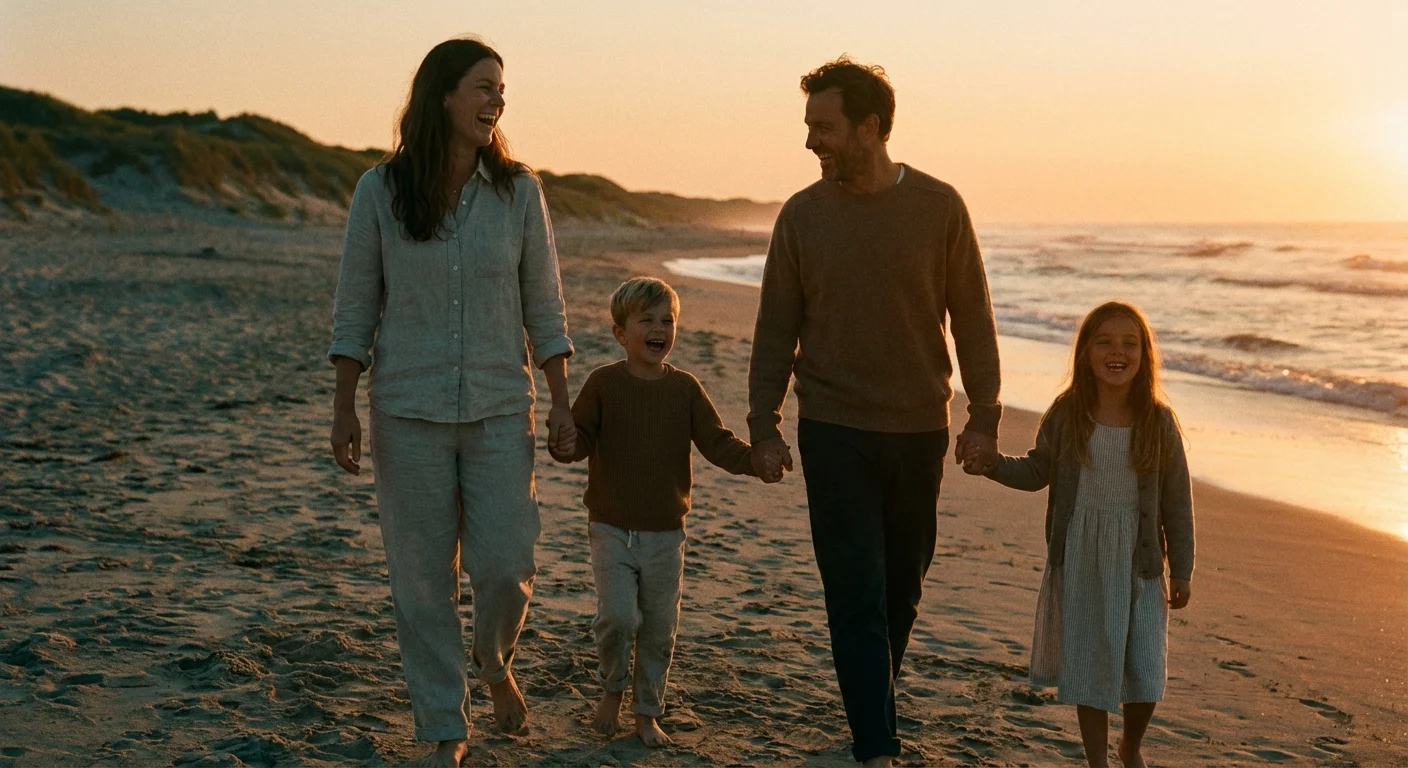
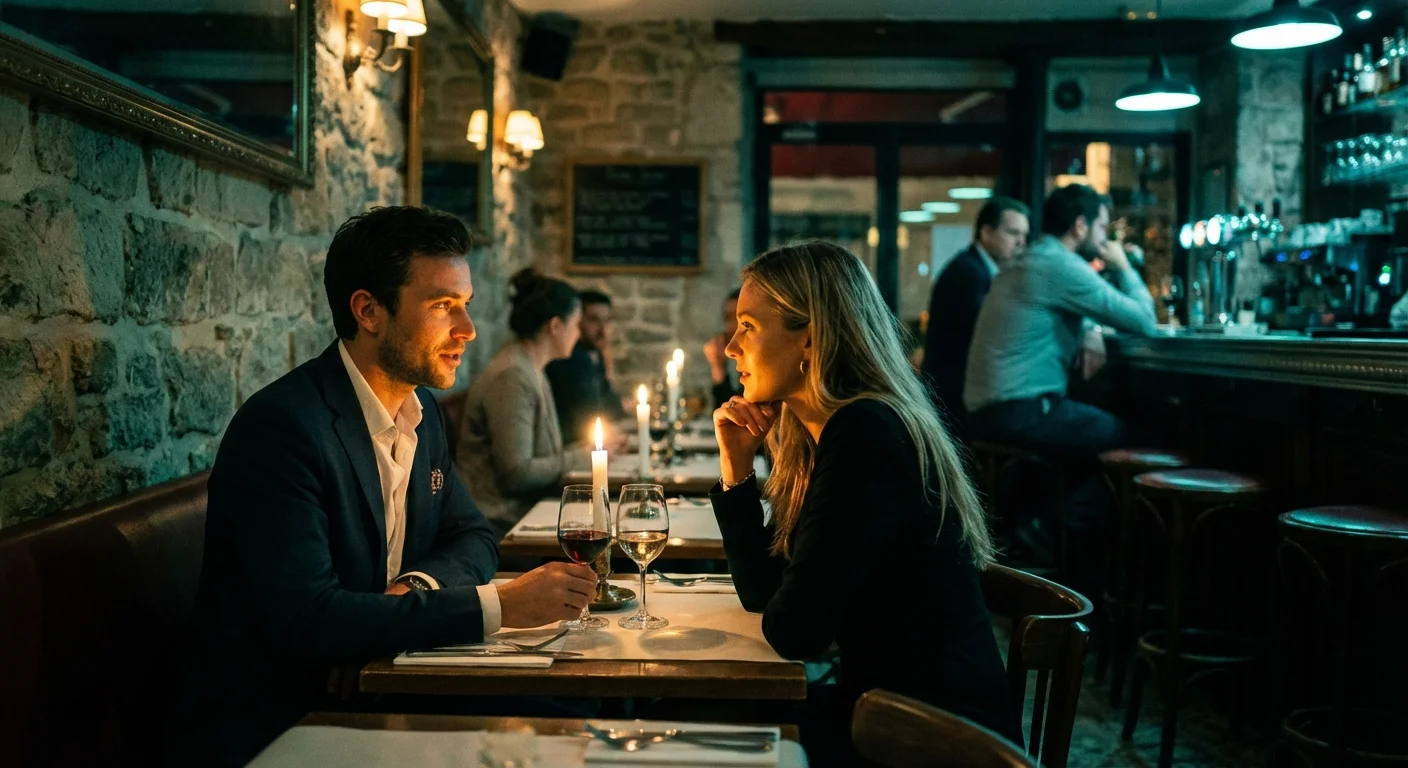
You return from a week-long family getaway with a camera roll full of memories—sun-drenched beach afternoons, moody dinners in dimly lit bistros, and bright morning hikes. While these moments are priceless, viewing them together often feels jarring. One photo is neon-bright and cool-toned, while the next is warm, dark, and grainy. This visual disconnect happens because our cameras react differently to varying light sources and environments. To transform these scattered snapshots into a professional-looking gallery, you must master the art of color grading.
Color grading allows you to tell a unified story. It bridges the gap between different days and locations, giving your family vacation album a signature “vibe.” Whether you want a nostalgic, film-like warmth or a crisp, modern aesthetic, the following strategies will help you achieve a sophisticated, cohesive look for your entire collection.

Understanding the Power of Visual Cohesion
Visual cohesion is the “glue” that holds a photo series together. When you flip through a high-end travel magazine, you notice that every image—regardless of the subject—feels like it belongs in the same world. This isn’t accidental; it is the result of intentional color grading. For your family photos, cohesion serves two purposes: it reduces visual clutter and emphasizes the emotional weight of the memories rather than the technical settings of your camera.
Think of your vacation photos as a movie. A cinematographer uses a specific color palette to evoke a certain mood. A trip to the Italian countryside might benefit from warm yellows and earthy terracottas; a skiing trip in the Alps might look best with bright whites and deep, icy blues. By choosing a palette and sticking to it, you guide the viewer’s eye and create a more immersive experience for your family when they revisit these photos years from now.
Before you move a single slider, look at your set of photos as a whole. Identify the common threads. Is there a specific color that appears in many shots, like the blue of the ocean or the green of a forest? Use these recurring elements as your anchor points. If you want to dive deeper into how digital sensors interpret these colors, Cambridge in Colour offers excellent technical breakdowns on color perception and digital imaging.

Establishing Your Base Edit and White Balance
You cannot build a beautiful house on a shaky foundation. In photo editing, your foundation is the “base edit”—the initial correction of exposure, contrast, and white balance. Cohesive photo editing starts with neutralizing your images so they all begin from a similar baseline.
The biggest enemy of cohesion is inconsistent white balance. If your morning photos have a blue tint and your afternoon photos are orange, no amount of color grading will make them look unified. Start by selecting a “hero” image—the photo that best represents the lighting and mood you want for the series. Adjust the white balance until the whites look truly white and skin tones appear natural. Use the “Pick Target” eyedropper tool to click on a neutral gray or white object in your frame to get a head start.
“Consistency in white balance is the single most important factor in creating a professional-looking photo series; it creates a literal common light that ties every scene together.”
Once you have corrected your hero image, note the temperature and tint values. You will apply these as a starting point to other photos taken in similar lighting. Remember that exposure also plays a role. Use your histogram to ensure your highlights aren’t blowing out and your shadows still retain detail. A consistent black point—the darkest part of your image—is a subtle but powerful way to link photos. If you choose a “faded” look with lifted blacks in one photo, you should apply that same black point across the entire set.

Mastering the HSL Panel for Color Consistency
The HSL (Hue, Saturation, and Luminance) panel is where the magic of color grading photos happens. This tool allows you to manipulate specific colors without affecting the rest of the image. For a vacation set, the HSL panel is your primary tool for “cleaning up” distracting colors and unifying the palette.
Hue: Use this to shift colors toward each other. For example, if you have three different shades of blue in your ocean photos, you can shift the “Aqua” and “Blue” sliders until the water looks consistent across all shots. If you want a warmer look, you might shift your yellows toward orange.
Saturation: This controls the intensity. High-energy family vacations often look great with boosted vibrance, but be careful with saturation. A common professional trick for cohesion is to pick one or two colors to “mute.” If your family is wearing mismatched bright clothing, slightly desaturating the oranges or reds can make the overall gallery feel more sophisticated and less chaotic.
Luminance: This controls the brightness of specific colors. Darkening the luminance of the blue channel is a classic way to make a pale sky look deep and dramatic. Conversely, increasing the luminance of oranges and yellows can make skin tones pop and appear more radiant.
| Color Channel | Typical Vacation Adjustment | Effect on Cohesion |
|---|---|---|
| Blue | Shift Hue toward Cyan; Lower Luminance | Creates deep, consistent skies and water across different days. |
| Green | Shift Hue toward Yellow; Lower Saturation | Prevents “neon” grass from distracting from the subjects. |
| Orange | Slightly Increase Luminance | Ensures skin tones remain bright and healthy in various lighting. |
| Yellow | Shift Hue toward Orange; Lower Saturation | Reduces “color cast” from artificial lights or harsh sun. |

The Role of Lightroom Presets in Family Photography
Using lightroom presets family collections can save you hours of work, but they are often misunderstood. A preset is essentially a pre-recorded recipe of sliders. When you apply a preset to a batch of vacation photos, you are giving them all the same “flavor.” However, a preset is a starting point, not a finish line.
To use presets effectively for a cohesive look, follow these steps:
- Apply the preset to your “hero” image and tweak it until it is perfect.
- Select all other photos in that specific “scene” (e.g., all photos from the beach).
- Sync the settings, but uncheck “White Balance” and “Exposure.”
- Manually adjust the exposure and white balance for each individual photo.
This method ensures that the stylistic color grading—the HSL shifts, the grain, and the tone curve—remains identical across the set, while the basic technical levels are tailored to the specific light of each shot. If you are looking for technical reviews on the best software for managing these presets, Digital Photography Review provides comprehensive guides on the latest versions of Lightroom, Capture One, and mobile editing suites.
Avoid presets that are too heavy-handed. For family memories, you want the colors to feel enhanced, not artificial. If a preset makes your kids’ skin look green or turns the sky a weird shade of purple, dial back the “Amount” slider. Subtlety is the hallmark of professional color grading.
Advanced Grading with Color Wheels and Split Toning
If the HSL panel is for surgical corrections, the Color Grading wheels (formerly known as Split Toning) are for atmospheric storytelling. This tool allows you to inject specific colors into the shadows, midtones, and highlights of your images. This is the secret to getting that “cinematic” look you see in professional travel photography.
For a cohesive vacation set, you might choose a “complementary” color scheme. A popular choice is adding a touch of warm gold to the highlights and a subtle teal or navy to the shadows. Because blue and orange sit opposite each other on the color wheel, this creates a pleasing contrast that makes your subjects stand out. Even if one photo was taken in a dark museum and another on a sunny pier, applying this same shadow-and-highlight tint will unify them.
Be disciplined with your color choices. Use the “Global” wheel if you want to apply a single color wash over the entire image—this is great for creating a “vintage” feel. However, for most family photos, keeping the highlights slightly warm (for a healthy glow) and the shadows slightly cool (to keep them clean) works best. Keep the “Saturation” of these wheels low—usually between 3% and 10%. You want the viewer to feel the mood without being able to immediately identify that you’ve “tinted” the shadows blue.

Batch Processing and Synchronization Workflows
The thought of editing 500 vacation photos one by one is enough to make anyone give up. To maintain a cohesive look without spending your entire week at a computer, you must use batch processing. Efficiency is the key to actually finishing your photo projects.
Most professional editing software allows you to “Sync” or “Copy/Paste” settings. The workflow should look like this:
Group your photos by location or lighting condition. Your “Indoor Breakfast” photos will need different base adjustments than your “High Noon Sightseeing” photos. Edit the best photo from the “Indoor Breakfast” group. Once it looks exactly how you want, select all the other photos from that morning and hit the “Sync” button.
After syncing, scroll through the grid view. Look for “outliers”—images that look significantly darker or warmer than the others. Click into those and make small, incremental adjustments. This “top-down” approach ensures that you are looking at the forest (the whole gallery) before you focus on the individual trees (the specific photos).
“Batch editing isn’t just a time-saver; it is a visual necessity. It forces you to compare images side-by-side, ensuring that the ‘red’ in your daughter’s shirt looks the same in every frame of the sequence.”
If you are using mobile tools, look for the “Previous” button or “Copy Edits” function. Even on a phone, you can achieve remarkable cohesion by simply ensuring that the same HSL settings are carried over from one image to the next. This discipline prevents your Instagram or digital photo frame from looking like a chaotic mosaic of different styles.

Curating and Preserving Your Final Gallery
Cohesion isn’t just about color; it’s about curation. A cohesive look is easily ruined by “photo clutter”—too many similar shots or technical failures that don’t fit the aesthetic. After you have finished your color grading, perform a final culling. If you have ten photos of the same sunset, pick the two best ones. Reducing the volume of images makes the color grading more impactful.
Once you are happy with the visual flow, it is time to export and preserve your work. For a cohesive digital gallery, export your photos with the same dimensions and sharpening settings. If you plan to print these photos—which we highly recommend for family heritage—ensure you are exporting in a high-quality format like a 100% quality JPEG or a TIFF file.
When preserving these digital files, follow the “3-2-1” rule: three copies of your data, on two different media (like a hard drive and a cloud service), with one copy off-site. Your color-graded vacation photos are now a digital asset that belongs to your family history. Treat them with the same respect you would treat a physical heirloom. For those looking for long-term archival strategies, the Library of Congress Preservation site provides invaluable resources on maintaining digital records for future generations.
By taking the time to color grade your vacation photos, you aren’t just “fixing” pictures; you are crafting a legacy. You are ensuring that when your grandchildren look back at these photos, they don’t see technical camera flaws—they see the warmth of the sun, the vibrancy of the location, and the joy of a family together, all wrapped in a beautiful, cohesive visual story.
Frequently Asked Questions
What is the difference between color correction and color grading?
Color correction is the process of fixing technical issues like incorrect white balance, exposure, or contrast to make an image look natural. Color grading is an artistic choice where you apply specific tones and palettes to create a mood or a cohesive stylistic look across a series of images.
Can I achieve a cohesive look using only my smartphone?
Yes, you can use mobile apps like Lightroom Mobile, VSCO, or Snapseed to apply consistent edits. Most of these apps allow you to ‘copy and paste’ edits from one photo to another, which is the fundamental step in creating a cohesive look for your vacation gallery.
How do I make photos taken in different lighting look the same?
The key is to match the white balance and the black points. Use the eyedropper tool to select a neutral gray or white in each photo to align the temperature. Then, use the HSL (Hue, Saturation, Luminance) panel to ensure specific colors—like the green of the trees or the blue of the sky—match across the different lighting conditions.
Should I apply the same preset to every photo in my vacation album?
A preset is a great starting point, but you should rarely leave it as-is. After applying a preset, adjust the exposure and white balance for each individual shot to account for lighting changes. A ‘one-click’ solution often results in some photos looking over-processed while others remain dark.
Disclaimer: This article is for informational purposes only. When handling valuable or irreplaceable photographs, consider consulting a professional conservator. Always test preservation methods on non-valuable items first.


Leave a Reply