
You hold a digital camera or a smartphone, and you capture a moment that feels perfect—a genuine smile from a spouse, the bright eyes of a child, or the dignified gaze of a grandparent. However, when you view the image on a larger screen, you notice small distractions. Perhaps a stray blemish draws the eye away from the subject’s expression, or the lighting has left the eyes looking a bit dull. This is where portrait editing comes in.
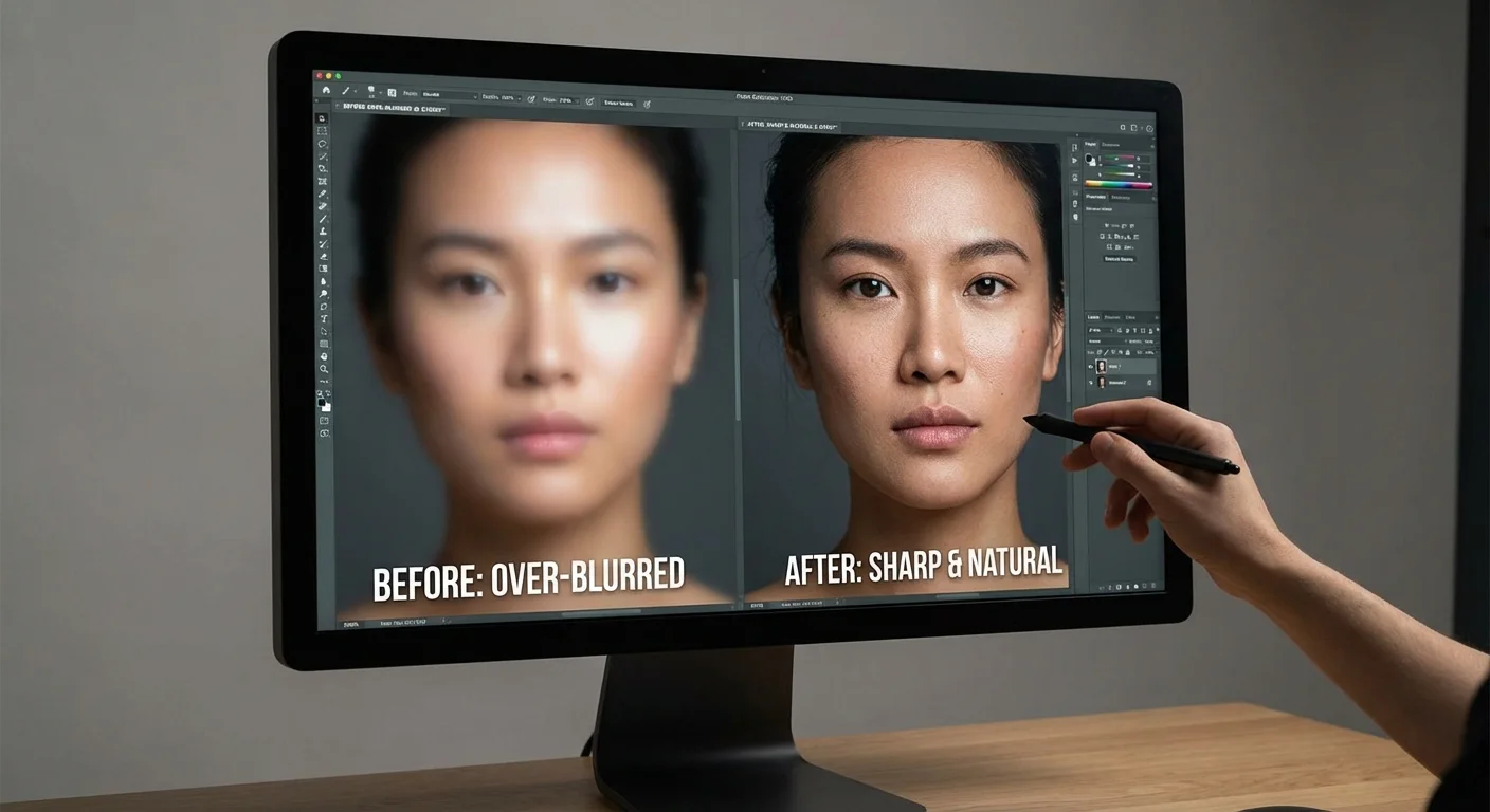
Portrait editing often suffers from a bad reputation because we frequently see “over-processed” images in advertisements and social media. You likely recognize the look: skin that resembles smooth plastic, eyes that glow like headlights, and features that feel uncanny. Your goal, however, is different. You want to preserve memories and honor the person in the photo. True success in portrait editing occurs when a viewer looks at your photo and thinks the person looks healthy and radiant, rather than thinking the photo was expertly edited.
The Foundational Philosophy of Natural Editing
Before you move a single slider, you must adopt a specific mindset. Think of yourself as a digital restorationist rather than a plastic surgeon. Your job involves removing temporary distractions while preserving the permanent character of the individual. This approach ensures that twenty years from now, when your family looks at these photos, they see the actual person they love, not a digitized version of them.
A helpful guideline used by professionals is the “Two-Week Rule.” If a feature on a person’s face will likely be gone in two weeks—such as a blemish, a small scratch, or a temporary bruise—you can ethically remove it. If the feature is permanent—such as a mole, a scar, or deep expression lines—you should leave it. These permanent features tell a person’s life story. If you feel these features are too distracting, you can subtly soften them, but you should never erase them entirely.
The best edit is the one that no one notices; it directs the viewer’s attention to the subject’s soul rather than the editor’s handiwork.
You also need to understand the relationship between light and texture. Over-processing happens when you prioritize “smoothness” over “detail.” Human skin has pores, fine hairs, and subtle color variations. When you use tools that blur these details, you lose the three-dimensional quality of the face, making it look flat and artificial. To keep your portraits realistic, you must protect the texture at all costs.

Choosing Your Digital Toolkit for Portraiture
The tools you choose will dictate how much control you have over the final image. While many free apps offer “one-tap” beauty filters, these are usually the primary culprits behind the over-processed look. To achieve professional, natural results, you need software that allows for localized adjustments—edits that apply only to specific parts of the image.
| Software | Primary Strength | Best For |
|---|---|---|
| Adobe Lightroom | Non-destructive sliders and local adjustment brushes. | Beginners and intermediate users managing large libraries. |
| Adobe Photoshop | Advanced pixel-level control and frequency separation. | Detailed retouching and complex restorations. |
| Darktable (Free) | Powerful open-source RAW processing. | Users on a budget who want professional-grade tools. |
| Snapseed (Mobile) | Intuitive localized “Healing” and “Selective” tools. | Quick, high-quality edits on smartphones or tablets. |
For more technical insights into how different sensors capture these details, you can explore the technical reviews at Digital Photography Review. Regardless of the software you select, always try to work with RAW files if your camera supports them. RAW files contain much more data in the shadows and highlights, allowing you to recover detail in a person’s skin or eyes that a compressed JPEG might discard.
Mastering the Art of Skin Retouching
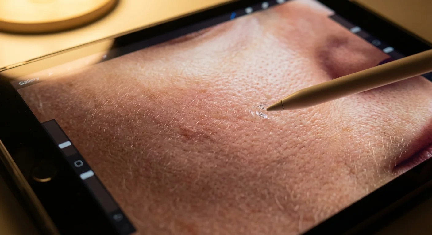
When you begin retouching skin, start with the most precise tool available: the Spot Healing Brush or the Patch Tool. These tools don’t just “paint” over a blemish; they use algorithms to sample the texture from a nearby “clean” area of skin and blend it over the distraction.
Step 1: Spot Removal. Zoom in to 100% and scan the face. Tap on temporary blemishes one by one. Avoid dragging the brush in long strokes; instead, use small, targeted clicks. This prevents the software from creating “smears” in the skin texture. If you are working on a heritage photo that has been scanned, this same tool works wonders for removing dust motes or small cracks in the emulsion of the physical print.
Step 2: Softening, Not Blurring. Most beginners reach for the “Clarity” slider and move it to the left to smooth skin. Avoid this. Moving Clarity to the left kills the midtone contrast, making the person look like they are standing in a thick fog. Instead, look for a “Texture” slider (found in Lightroom and ACR). Decreasing the Texture slider slightly (between -10 and -20) will soften the skin while keeping the underlying structure sharp.
Step 3: Managing the T-Zone. The forehead, nose, and chin often accumulate “shine” from camera flashes or oily skin. You don’t want to remove the highlights entirely, as this makes the face look flat. Instead, use a local adjustment brush to lower the “Highlights” or “Whites” in just those shiny areas. This maintains the shape of the face while removing the distracting glare.
Achieving Lifelike Skin Tones and Color Balance
Correct skin tone is arguably more important than perfect skin texture. If the skin looks too orange, too green, or too blue, the person will look sickly. This often happens because of “mixed lighting”—for example, a person standing near a window (blue light) while an indoor lamp (yellow light) is also turned on.
To fix this, you should first check your White Balance. Use the eyedropper tool in your software and click on a neutral gray or white area in the photo, such as the white of a person’s eye or a neutral-colored shirt. This provides a baseline for accurate colors. For a deeper understanding of how light temperature affects your images, refer to the guides at Cambridge in Colour.
- Hue: Use the HSL (Hue, Saturation, Luminance) panel to target specific colors. If skin looks too red (often the case with children or people who have been outside), move the Red Hue slider slightly toward Orange.
- Saturation: Be careful with global saturation. Instead, use “Vibrance.” Vibrance is “skin-tone aware”; it boosts the intensity of muted colors without over-saturating the reds and oranges typically found in human skin.
- Luminance: If a person’s skin looks “muddy” or dark, try increasing the Orange Luminance. Since orange is the primary color component in almost all human skin tones, increasing its luminance “lights the person up” from within without affecting the background.
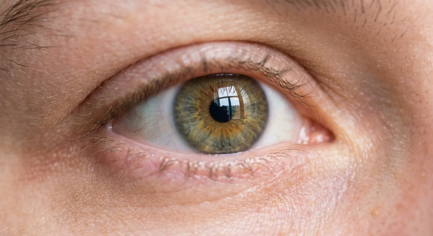
Bringing Life to the Eyes: Clarity and Light
The eyes are the focal point of any portrait. If the eyes are sharp and clear, the rest of the image can be relatively soft and still feel successful. However, the eyes are also where most beginners make the biggest mistakes. You must resist the urge to turn the eyes into glowing gems.
To enhance eyes naturally, create a circular mask over each iris. Start by increasing the Exposure very slightly—usually no more than +0.3 or +0.5. This mimics the way light naturally enters the eye. Next, increase the Clarity or Contrast within that mask. This defines the intricate patterns in the iris.
Pay special attention to the “catchlight”—the reflection of the light source in the pupil. If the catchlight is dim, the eyes look “dead.” Sharpening this tiny white dot can instantly make the subject look more alert and engaged. If the subject has “red-eye” from a flash, use the dedicated red-eye removal tool, but ensure the resulting pupil is a dark, natural charcoal color rather than a flat, solid black circle.
Regarding the “whites” of the eyes (the sclera), avoid the temptation to make them perfectly white. Human eyes are naturally a bit off-white, often containing tiny veins or subtle shadows from the eyelids. If you make them pure white, the person will look like a character from a science fiction movie. Instead, use a brush to lower the Saturation slightly and lift the Shadows just enough to remove a heavy cast.
Recognizing and Avoiding the Over-Processed Look
Over-processing is often a result of “layering” too many edits without stepping back to view the whole image. You might spend thirty minutes perfectly smoothing the skin, only to realize later that the face no longer matches the texture of the neck or hands. Consistency is key to a believable edit.
One effective trick is the “Zoom-Out Test.” After you finish your edits, zoom out until the photo is small on your screen—about the size of a postage stamp. At this scale, does anything look “wrong”? If the eyes look like two white dots or the skin looks like a flat beige mask, you have gone too far.
Another pitfall is over-sharpening. While you want the eyelashes and eyebrows to be crisp, excessive sharpening creates “halos” or digital noise around the edges of features. Use the “Masking” slider in your sharpening panel (hold down the Alt/Option key while sliding in Lightroom) to ensure you are only sharpening the edges of the eyes and mouth, rather than the flat surfaces of the skin.

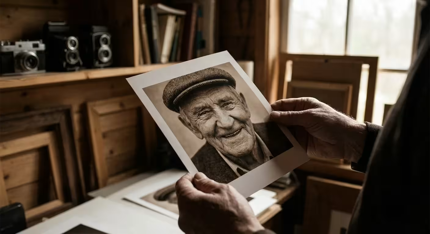
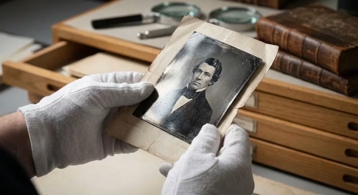
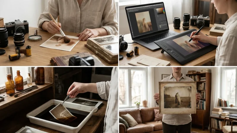
Editing Workflow for Preserving Family History
When you are editing a portrait of an ancestor from a scanned film negative or a physical print, your priorities shift slightly. These photos often suffer from fading, physical damage, or “silver mirroring.” Your goal here is to return the photo to its original state, not to modernize it.
- Neutralize the Fade: Use the “Dehaze” slider very sparingly to bring back contrast that has been lost to time.
- Repair Physical Damage: Use the Clone Stamp tool for larger cracks and the Healing Brush for small dust spots. Work on a separate layer if your software allows it, so you never destroy the original pixels of the scan.
- Respect the Era: Do not try to make a 1940s portrait look like it was taken on a modern digital camera. Keep the grain. If the photo is sepia-toned or black and white, do not try to add artificial color unless you are specifically doing a “colorization” project. The original tones are part of the historical record.
- Export for Longevity: When you finish your edit, save a high-resolution, uncompressed version (like a TIFF file). This ensures that your edited version is preserved with the same quality as the original scan.
By following these steps, you treat the person in the photograph with the respect they deserve. You aren’t just “fixing” a photo; you are ensuring that the essence of that individual—their spark, their character, and their story—remains visible for the next generation.
Frequently Asked Questions
How do I avoid making skin look like plastic in my edits?
To avoid a plastic appearance, always maintain the natural skin texture. Use a low opacity setting (between 20% and 40%) when applying smoothing brushes and never completely remove natural lines or pores. Instead of blurring the skin, use the ‘Healing Brush’ to target specific blemishes while leaving the surrounding texture intact.
What is the best software for a beginner to start editing portraits?
Adobe Lightroom is widely considered the best starting point for beginners because of its intuitive sliders and non-destructive editing environment. For those seeking free options, Darktable offers professional-grade tools, while mobile users can achieve excellent results with Snapseed or Lightroom Mobile.
Should I remove moles or birthmarks when retouching a portrait?
The general rule of thumb in professional retouching is to only remove temporary distractions. This includes acne, stray hairs, or bruises. Permanent features like moles, birthmarks, and character lines are part of a person’s identity. Only remove them if the subject specifically requests it; otherwise, focus on reducing their prominence slightly through lighting adjustments if they are distracting.
How can I make eyes pop without making them look fake?
The key to realistic eyes is focusing on the ‘catchlight’—the small reflection of light in the pupil. Subtly increase the exposure and contrast of these reflections. When brightening the whites of the eyes, do not make them pure white; instead, lift the shadows slightly and reduce any redness using a desaturation brush, ensuring the result still looks like organic tissue.
Disclaimer: This article is for informational purposes only. When handling valuable or irreplaceable photographs, consider consulting a professional conservator. Always test preservation methods on non-valuable items first.


Leave a Reply