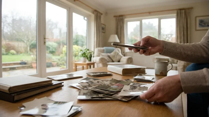
Preserving your family’s photographic heritage involves more than simply scanning old prints. Years of exposure to light, moisture, and poor storage conditions often lead to faded colors, unsightly color casts, and a general loss of vibrancy. Your goal in digitizing these precious memories is to make them accessible and beautiful for future generations. Learning how to fix colors on scanned old photos is a vital step in this process. This guide provides practical, actionable insights to help you perform effective color correction scanning and bring those vibrant memories back to life. You can significantly improve the quality of your digital archives with the right tools and techniques, ensuring your family’s visual history is accurately preserved.
Understanding Color Fading and Shifts in Old Photographs
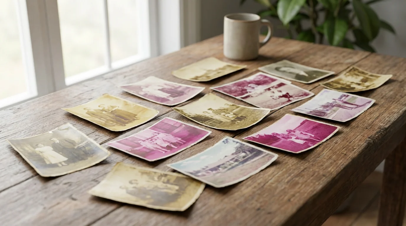
Old photographs, particularly those from the mid-20th century, often suffer from irreversible chemical degradation. The dyes used in photographic papers and films were not always stable, leading to characteristic color shifts over time. Knowing what to expect helps you approach your color restoration efforts more effectively.
Common issues you will encounter include:
- Yellowing: This affects many black and white prints, particularly silver gelatin prints stored in acidic environments. The paper base itself yellows, often accompanied by a loss of image contrast.
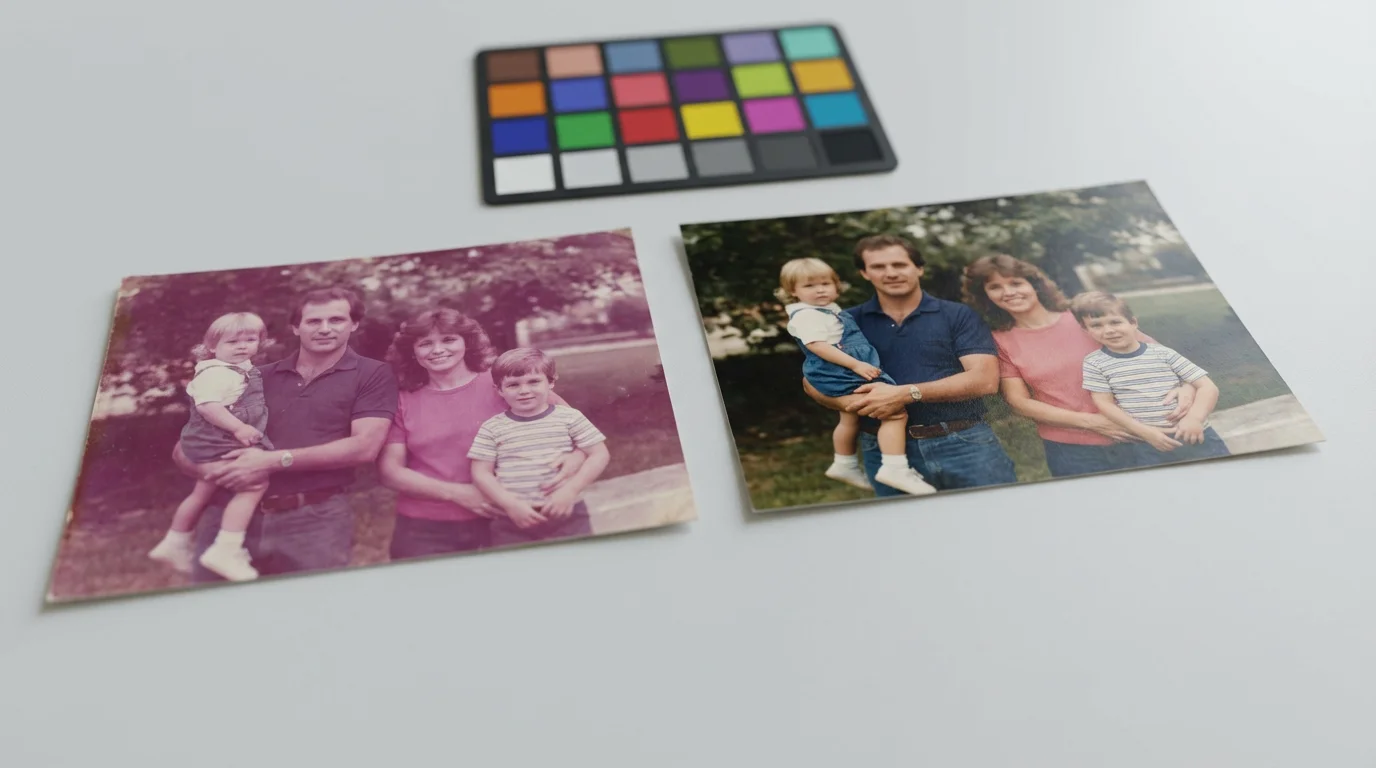
- Magenta Cast: Early color prints, especially those using Agfacolor or Kodachrome processes, frequently develop a distinct magenta or pink cast as the cyan and yellow dyes fade faster than the magenta dye. This shifts the overall image color dramatically, often making skin tones look unhealthy.
- Blue/Green Cast: Some photo types, though less common, exhibit a blue or green cast, often due to a shift in the yellow layer or environmental factors. This can make landscapes appear unnatural or skin tones cold.
- Overall Fading: Exposure to UV light is a major culprit for uniform fading across all colors, causing images to look dull, washed out, and lacking saturation. The image becomes flat, losing its original depth and vibrancy.
Keep in mind that similar chemical degradation also impacts film, requiring specialized techniques when creating digital copies of photo negatives and slides.
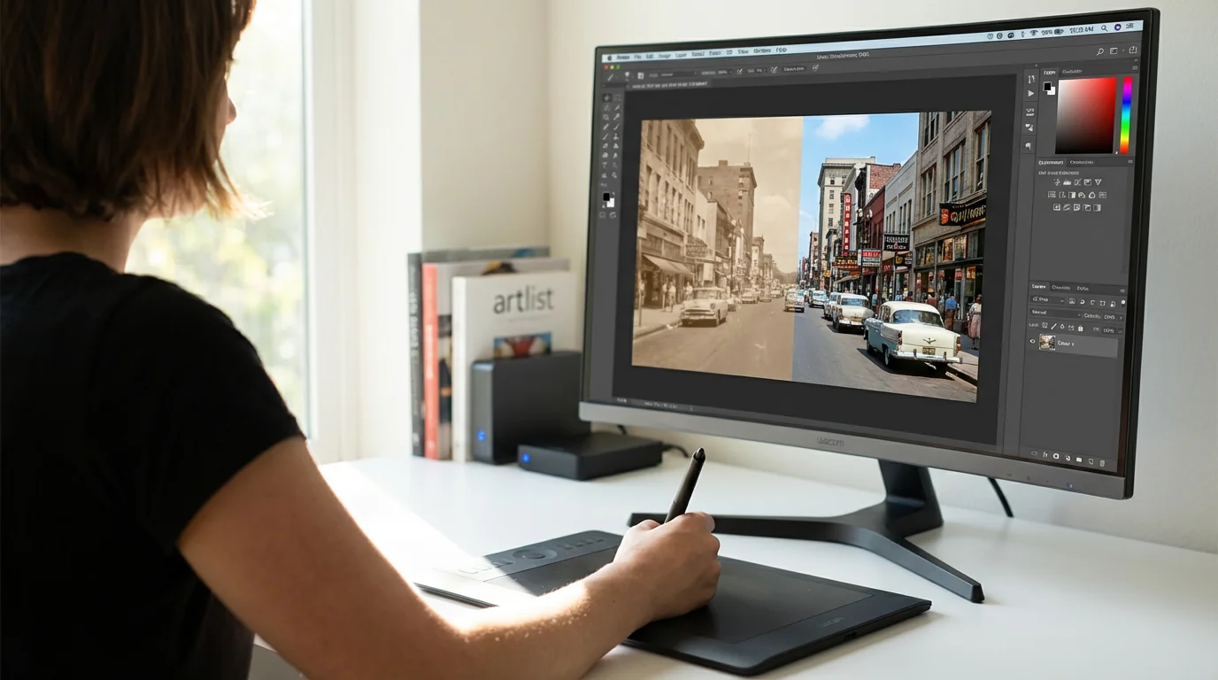
Understanding these specific shifts guides your color correction scanning process. For example, a magenta cast tells you to boost cyan and green channels. A general fade indicates a need to increase contrast and saturation across the board. The goal is not always to return to a scientifically perfect original color, but rather to achieve a visually pleasing and historically accurate representation that respects the original moment.
Essential Software and Tools for Color Correction
Effective color correction relies on capable software. You have several options, ranging from professional-grade applications to user-friendly freeware. Your choice depends on your budget, technical comfort level, and the depth of correction you require.
Beyond basic color work, you can follow specialized workflows to restore old faded photos and bring back lost details using advanced layering techniques.
Here are the primary tools:
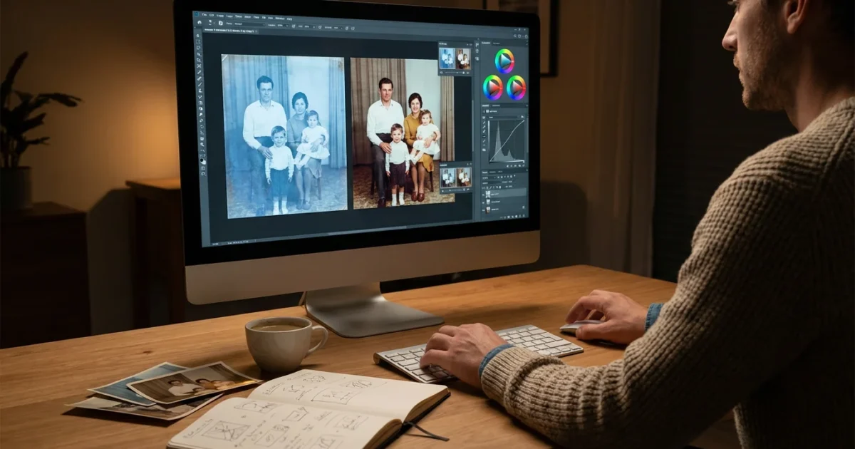
- Adobe Photoshop: This industry-standard software offers the most comprehensive suite of tools for photo manipulation, including advanced color correction capabilities. Its layers, masks, and adjustment layers provide non-destructive editing, which is crucial for preserving your original scan. Photoshop allows precise control over every aspect of color, tone, and detail.
- Adobe Lightroom: Excellent for batch processing and organizing large collections, Lightroom offers powerful global and local adjustments. While it lacks some of Photoshop’s pixel-level editing tools, its color grading, tone curve, and calibration features are highly effective for correcting faded and shifted colors. You can synchronize adjustments across multiple images, saving significant time.
- GIMP (GNU Image Manipulation Program): A powerful, free, open-source alternative to Photoshop. GIMP provides many similar features, including layers, curves, levels, and color balance tools. It has a steeper learning curve than some simpler editors, but its capabilities make it a strong contender if you prefer not to invest in commercial software.
- Affinity Photo: A one-time purchase professional editor that offers a strong alternative to Photoshop. It features a robust set of color correction tools, including comprehensive support for layers, masks, and non-destructive adjustments, providing excellent value for its price.
- Built-in Photo Editors (Windows Photos, Apple Photos): These applications offer basic but effective tools for exposure, contrast, white balance, and saturation adjustments. They are perfect for quick fixes on less severely damaged photos or for beginners getting started with editing. While they may not offer the granular control of professional software, they provide a good entry point.
For those with high volumes of severely damaged prints, it may be helpful to research if professional photo scanning services are a better investment for your time.
For serious color restoration, investing time in learning a more advanced program like Photoshop or GIMP will yield the best results. These tools provide the precision necessary to subtly adjust scanned photos and achieve professional-looking restorations.

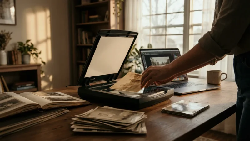
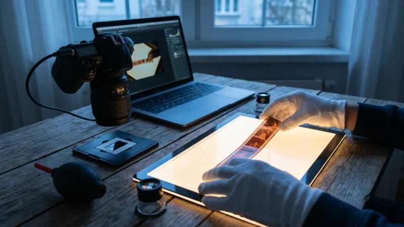
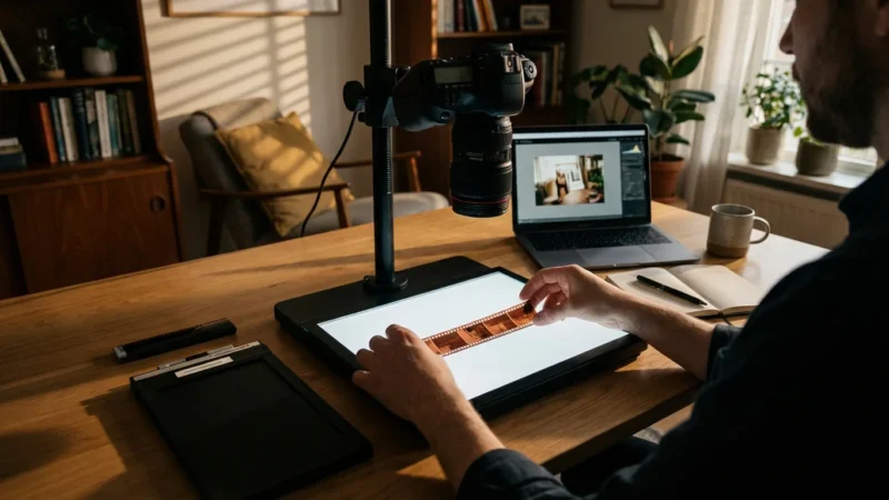
Preparing Your Scans for Optimal Color Correction
The quality of your scan directly impacts the success of your color correction efforts. A poor scan provides less data to work with, making satisfactory adjustments challenging. Focus on capturing as much detail and color information as possible during the scanning phase.
In addition to correcting color, you may need to learn how to remove scratches and dust from scanned photos to clean up physical damage.
Follow these best practices for scanning:
- Scan at High Resolution: Aim for at least 600 DPI (dots per inch) for standard-sized prints. For smaller photos or those you anticipate cropping heavily, 1200 DPI or higher provides excellent flexibility. Higher resolution captures more detail, allowing for larger prints or significant cropping without pixelation. It also retains more subtle tonal information, aiding in precise color restoration.
- Choose the Right Color Depth: Scan in 24-bit RGB (8 bits per channel) at minimum. For the best quality, use 48-bit RGB (16 bits per channel) if your scanner and software support it. Higher bit depth captures a wider range of colors and tones, minimizing banding and providing more latitude for adjustment before degradation occurs. This is critical when you need to adjust scanned photos with significant fading.
- Scan in Color, Even for Black and White Photos: Always scan black and white photographs in color mode. While counterintuitive, scanning in color captures a fuller tonal range. You can then convert the image to true grayscale in your editing software, leveraging the richer data for better contrast and detail retention.
- Disable Automatic Corrections: Your scanner software often offers automatic color correction, sharpening, or dust removal. Disable these features. While convenient, they often make irreversible changes that can hinder your manual color restoration efforts. Perform all adjustments in your dedicated editing software.
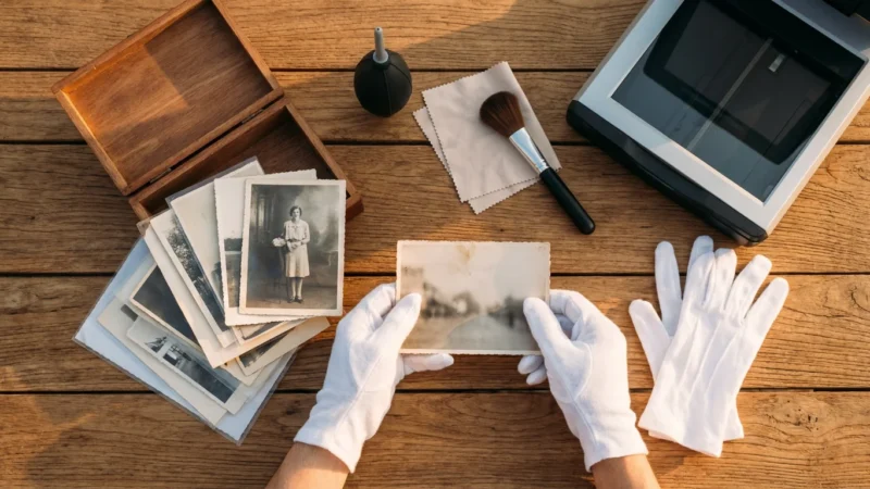
- Clean Your Scanner and Photos: Dust and fingerprints translate directly into imperfections on your scan. Use a lint-free cloth and compressed air to clean your scanner bed. Gently wipe photos with a soft, dry cloth or use a static brush to remove surface dust.
- Save in a Lossless Format: Save your initial scans in a lossless format like TIFF. This preserves all the captured image data without compression artifacts. You can convert to JPEG for sharing or web use later, but always retain the original TIFF file as your archival master.
If you are just beginning your digitization project, follow our how to scan old photos at home guide to ensure your source files are captured correctly.
A well-executed scan gives you the best possible starting point for any digital manipulation. Do not rush this foundational step.
“The most crucial step in digital photo restoration happens before you even open your editing software. A high-quality scan, capturing maximum detail and color depth, provides the essential foundation for any successful color correction. Without good data, even the most powerful tools are limited.”
Mastering Basic Adjustments: White Balance and Exposure
Once you have a high-quality scan, begin your color correction by addressing fundamental aspects of the image: white balance and exposure. These global adjustments often resolve many common issues before you delve into more nuanced color work.
1. Correct White Balance (Color Cast Removal)
White balance ensures that true white objects in your photo appear white, not tinged with yellow, blue, or magenta. An incorrect white balance is the primary cause of many unwanted color casts in old photos.
- Use the White Balance Tool (Eyedropper): Most photo editors feature a white balance eyedropper. Locate a neutral gray or white area in your image. Clicking this area with the eyedropper tells the software what “should” be neutral, and it then adjusts all other colors accordingly. Be selective; a slightly off-white area will give an inaccurate result. If no neutral area exists, estimate or move to manual sliders.
- Manual Adjustment Sliders: If the eyedropper is ineffective, use temperature and tint sliders.
- Temperature (Blue/Yellow): Move the slider towards blue to counteract a yellow or warm cast, or towards yellow to correct a blue or cool cast.
- Tint (Green/Magenta): Adjust the slider towards green to neutralize a magenta cast, or towards magenta to counteract a green cast.
Make small adjustments. Look at skin tones, skies, and any known colors for guidance. This is often the first and most impactful step to adjust scanned photos effectively.
2. Adjust Exposure (Brightness and Contrast)
Faded photos often lack punch, appearing dull and flat. Adjusting exposure, contrast, and highlights/shadows brings back vitality.
- Exposure/Brightness: This controls the overall lightness or darkness of the image. Increase exposure slightly for underexposed (too dark) photos, or decrease it for overexposed (too bright) ones. Avoid clipping highlights (losing detail in bright areas) or crushing shadows (losing detail in dark areas).
- Contrast: Contrast defines the difference between the lightest and darkest areas. Faded photos typically benefit from an increase in contrast to add depth and “pop.” However, excessive contrast can lead to a harsh, unnatural look.
- Highlights and Shadows: These sliders offer more refined control.
- Highlights: Reduce highlights to recover detail in overly bright areas, such as blown-out skies or reflective surfaces.
- Shadows: Increase shadows to reveal detail in dark areas without globally brightening the entire image. This is particularly useful for old photos where details hide in deep shadows.
- Blacks and Whites: These settings determine the absolute black and white points in your image. Adjusting these can expand the dynamic range and ensure you have true blacks and whites without losing detail.
Always work non-destructively by using adjustment layers in programs like Photoshop. This allows you to revisit and fine-tune your settings at any point without altering the original pixel data of your scanned image.

Targeted Color Restoration: Levels and Curves Explained
Once basic white balance and exposure are set, move on to more powerful tools for targeted color and tonal adjustments: Levels and Curves. These tools provide exceptional control over the tonal range and individual color channels, crucial for comprehensive color restoration.
1. Using Levels for Tonal and Color Range Adjustment
The Levels adjustment tool maps the existing tonal range of your image to a new, desired range. It works by analyzing the histogram, which graphically represents the distribution of pixels across different brightness levels.
How to Use Levels:
- Open the Levels Adjustment: In most editing software, you find Levels under “Image > Adjustments” or as an adjustment layer.
- Analyze the Histogram: A healthy histogram shows pixels distributed across the entire range from black (left) to white (right). Faded photos often have histograms compressed towards the middle, indicating a lack of true blacks and whites.
- Set Black and White Points: You will see three sliders below the histogram:
- Black Point (left): Drag this slider inward from the left edge to the point where the histogram data begins. This sets the darkest point in your image to pure black, adding contrast and depth.
- White Point (right): Drag this slider inward from the right edge to where the histogram data ends. This sets the lightest point to pure white, brightening the image and increasing contrast.
- Midtone Slider (middle, Gamma): Adjust this slider to brighten or darken the mid-tones without affecting the black and white points. Moving it left brightens mid-tones, moving it right darkens them. This is key for overall exposure refinement.
- Adjust Individual Color Channels: The real power of Levels for color restoration lies in its ability to adjust individual color channels (Red, Green, Blue).
- Select the “Red” channel from the dropdown menu. If your photo has a green or blue cast, you might need to increase red in the mid-tones.
- Select the “Green” channel. To counteract a magenta cast, you typically increase green in the mid-tones.
- Select the “Blue” channel. If your photo has a yellow cast, increase blue in the mid-tones.
By subtly adjusting the mid-tone slider for each channel, you can shift the color balance very precisely. For example, a common magenta cast in old photos is often corrected by slightly dragging the mid-tone slider in the Green channel to the left (brightening greens) and the mid-tone slider in the Red channel slightly to the left (brightening reds), and the Blue channel to the right (darkening blues). This helps to adjust scanned photos towards a more neutral color.
2. Mastering Curves for Advanced Tonal and Color Control
The Curves adjustment is one of the most powerful and versatile tools available, offering even more precise control over tonal range and individual color channels than Levels. It allows you to remap any input tonal value to any output tonal value using a graphical curve.
How to Use Curves:
- Open the Curves Adjustment: Like Levels, Curves is available as an adjustment layer in most professional editing software. You will see a diagonal line on a graph. The bottom-left represents blacks, and the top-right represents whites.
- Adjust Tonal Contrast (RGB Channel):
- Click on the diagonal line to create anchor points.
- Create an “S-curve” for increased contrast: Drag a point in the bottom-quarter slightly down (to darken shadows) and a point in the top-quarter slightly up (to lighten highlights). This steepens the curve, increasing contrast.
- To reduce contrast (for overly contrasty images), create a gentler, flatter curve.
- Adjust Individual Color Channels for Color Restoration: This is where Curves truly shines for color restoration. Switch from the “RGB” channel to “Red,” “Green,” or “Blue.”
- To remove a Magenta cast: Go to the Green channel. Create a point in the mid-tones and drag it slightly upwards. This adds green to the mid-tones, neutralizing magenta.
- To remove a Yellow cast: Go to the Blue channel. Create a point in the mid-tones and drag it slightly upwards. This adds blue, neutralizing yellow.
- To remove a Blue cast: Go to the Yellow channel (or Blue and drag down). For a blue cast, often you can go to the Red channel and drag up, or the Green channel and drag up. You want to reduce blue, which means adding yellow. In the Blue channel, dragging the curve down adds yellow.
You can add multiple points to target specific tonal ranges within a single color channel. For instance, you might only want to remove a magenta cast from the shadows, leaving highlights untouched.
Levels and Curves require practice. Start with subtle adjustments. Use reference images of accurately colored historical photos if possible. The goal of color restoration is to bring authenticity back, not to create an entirely new look.

Removing Color Casts with Specific Tools
Beyond Levels and Curves, dedicated color adjustment tools offer more direct control for tackling persistent color casts. These tools provide different approaches to fine-tuning the color balance across your image.
1. Color Balance
Color Balance provides three sliders, each representing a color pair: Cyan/Red, Magenta/Green, and Yellow/Blue. This tool allows you to add or subtract these colors across three tonal ranges: Shadows, Midtones, and Highlights.
How to Use Color Balance:
- Target the Cast: If your photo has a strong magenta cast, go to the Magenta/Green slider and move it towards Green. If it has a yellow cast, move the Yellow/Blue slider towards Blue.
- Refine by Tonal Range: Often, a color cast might be more prominent in the shadows or highlights. Use the dropdown menu (e.g., “Shadows,” “Midtones,” “Highlights”) to target your adjustments precisely. For example, old photos often have a magenta cast that is most visible in the midtones and shadows.
Color Balance is intuitive and excellent for making broad yet controlled changes.
2. Hue/Saturation
The Hue/Saturation adjustment lets you modify the hue (the actual color, e.g., red, green, blue), saturation (intensity of the color), and lightness of specific color ranges or the entire image.
How to Use Hue/Saturation:
- Global Adjustments: For generally faded photos, increasing global saturation can bring back some vibrancy. Be cautious not to oversaturate, which can make colors look artificial.
- Targeted Color Correction: This tool truly shines when you need to adjust specific color ranges.
- Select a specific color from the dropdown menu (e.g., “Reds,” “Yellows”).
- Adjust the Hue slider to shift that color. For example, if skin tones look too orange, you might select “Reds” and slightly shift the hue towards yellow or magenta.
- Adjust the Saturation slider to increase or decrease the intensity of that specific color. This is very useful for toning down overly vibrant colors or boosting dull ones.
- Adjust the Lightness slider to brighten or darken that specific color range.
For instance, if a photo has a muted blue sky, you can select “Blues” and increase saturation and perhaps lightness to make the sky pop without affecting other colors.
3. Selective Color
Selective Color provides even more granular control than Hue/Saturation. It allows you to adjust the amount of Cyan, Magenta, Yellow, and Black (CMYK) in specific primary and secondary colors (Reds, Yellows, Greens, Cyans, Blues, Magentas, Whites, Neutrals, Blacks).
How to Use Selective Color:
- Choose a Color: Select the color you want to adjust from the “Colors” dropdown menu (e.g., “Reds” if skin tones are problematic, “Neutrals” if you want to fine-tune grayscale areas).
- Adjust CMYK Sliders: For the chosen color, manipulate the Cyan, Magenta, Yellow, and Black sliders.
- For example, if a photo has an overall magenta cast, you could select “Neutrals” and reduce Magenta, or increase Green (the opposite of magenta). You might also select “Reds” and “Yellows” and adjust their magenta values.
- To remove yellowing from whites, select “Whites” and increase Blue, while slightly reducing Yellow.
This tool often requires a good understanding of color theory and CMYK relationships, but it offers unparalleled precision for difficult color shifts. You can use these tools individually or in combination, always remembering to work non-destructively with adjustment layers to maintain flexibility and control during your color restoration process.

Refining Details and Minimizing Noise
After successfully adjusting scanned photos for color and tone, your images will likely look much improved. The next step involves enhancing their clarity and removing unwanted artifacts. This typically means sharpening details and reducing digital noise.
1. Sharpening for Clarity
Old photos, even after high-resolution scanning, can sometimes appear soft or slightly out of focus due to the original photography conditions or the scanning process itself. Sharpening helps bring out fine details.
Effective Sharpening Techniques:
- Unsharp Mask: This is the most common and effective sharpening filter. It works by increasing the contrast along edges. In your editing software, you typically find three sliders:
- Amount: Controls the intensity of the sharpening effect. Start with moderate values.
- Radius: Determines how far from an edge the sharpening is applied. A small radius sharpens fine details, a larger radius affects broader areas.
- Threshold: Prevents sharpening of areas that are already smooth, like skin or skies. This helps avoid accentuating noise.
Apply Unsharp Mask judiciously, typically as the final step in your editing process. Over-sharpening introduces halos around edges and makes the image look unnatural.
- Smart Sharpen: More advanced than Unsharp Mask, Smart Sharpen allows you to control how the sharpening is applied based on different types of blur (Gaussian Blur, Lens Blur, Motion Blur). This can provide a cleaner sharpening effect with fewer artifacts.
- High Pass Filter (Advanced): For very precise sharpening, apply a High Pass filter on a duplicated layer set to an overlay or soft light blend mode. This method sharpens edges while preserving tonal values and is excellent for avoiding harsh effects.
Always view your image at 100% zoom when sharpening to accurately assess the impact of your adjustments.
2. Noise Reduction
Scanned old photos, particularly those from lower-quality originals or scans done at higher ISO settings (though less common with flatbed scanners), can exhibit digital noise or grain. This appears as random speckles or discoloration.
Noise Reduction Strategies:
- Luminance Noise Reduction: This addresses the grayscale noise, which looks like fine grain. Most software provides a slider to reduce luminance noise. Apply this carefully, as excessive reduction can lead to a “plastic” or “smudged” look, blurring fine details.
- Color Noise Reduction: This tackles colored speckles, often visible in shadow areas. Color noise is usually easier to remove without losing significant detail. Most noise reduction tools have a separate slider for color noise.
- Selective Application: If noise is only prevalent in certain areas (e.g., dark backgrounds), consider applying noise reduction selectively using masks. This preserves detail in important areas like faces or textures.
- Avoid Over-Reduction: Old photos often have natural film grain. Completely eliminating it can make the photo look artificial. Aim for a balance where noise is minimized but the image retains its natural texture. Some “digital grain” filters can even be added subtly to restore a natural film-like appearance if original grain was removed too aggressively.
Noise reduction should generally precede sharpening, as sharpening can sometimes accentuate noise. However, some workflows integrate them closely. Experiment to find the balance that works best for each image.
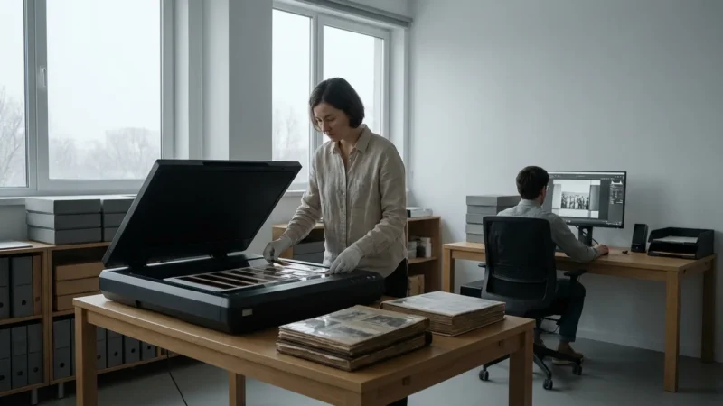
Workflow for Consistent and Efficient Color Correction
Developing a consistent workflow for color correction is crucial, especially when you have many photos to process. A structured approach saves time, ensures quality, and helps you achieve uniform results across your collection.
1. Establish a Standard Process:
Create a mental or written checklist of the steps you follow for each image. A typical order includes:
- Initial Scan: High resolution, 48-bit color, lossless TIFF, no automatic corrections.
- Basic Cropping and Straightening: Correct any obvious misalignment or unwanted borders.
- Spot Removal: Address dust, scratches, and major blemishes.
- White Balance: Eliminate overall color casts using eyedroppers or manual temperature/tint sliders.
- Exposure & Contrast: Adjust overall brightness, shadows, highlights, and mid-tones using Levels or basic exposure sliders.
- Color Adjustment: Refine specific color casts and vibrancy using Curves, Color Balance, or Hue/Saturation.
- Sharpening & Noise Reduction: Enhance clarity and minimize digital artifacts.
- Final Review: Compare to the original, check for artifacts, and ensure a natural look.
- Save: Save as a master TIFF, then export copies for sharing (JPEG) or printing.
2. Utilize Adjustment Layers and Smart Objects:
In advanced software like Photoshop, always use adjustment layers (e.g., Levels, Curves, Hue/Saturation layers) instead of direct image adjustments. This enables non-destructive editing. You can turn layers on/off, change their opacity, and modify settings at any time without altering the original pixel data. For transformations like resizing or rotating, convert your image to a Smart Object to preserve original pixel information.
3. Create Presets and Actions:
Once you find a set of adjustments that frequently work for a specific type of fading (e.g., a “Magenta Fade Correction” preset), save it.
- Presets: Many tools (like Lightroom’s develop module or Photoshop’s Camera Raw) allow you to save your adjustment settings as presets. You can apply these with one click to similar images.
- Actions (Photoshop): For repetitive sequences of steps (e.g., “open file, apply unsharp mask, save as JPEG”), record an “Action.” You can then run this action on a single image or batch process an entire folder. This dramatically speeds up your workflow.
This strategy allows you to apply `color restoration` consistently across numerous photos, reducing repetitive work.
4. Batch Processing:
When you have a large number of photos with similar issues (e.g., an entire album showing the same yellowing), batch processing is invaluable.
- Apply a saved preset or action to a folder of images.
- Review each image after batch processing, as some may still require individual fine-tuning.
While batch processing can save time, remember that each old photo is unique. Use batch tools to get 80% of the way there, then dedicate individual attention to the remaining 20%.
5. Use Reference Photos:
If you have an accurately colored print from the same era or scene, use it as a reference for your color restoration. Place it alongside your digital image on your monitor (if your monitor is color-calibrated) to guide your color correction efforts. This helps you achieve more accurate and believable colors, especially when tackling `color correction for faded photographs`.
This structured approach ensures that your efforts to `adjust scanned photos` are both effective and sustainable, allowing you to tackle even large archives with confidence.

Preserving Your Corrected Images for the Future
Completing the color correction on your scanned photos is a significant achievement, but the work does not end there. Proper preservation ensures these beautifully restored memories remain accessible and safe for generations to come.
1. Choose the Right File Formats:
- Master Files (Archival): Always save your fully color-corrected images in a lossless format like TIFF (Tagged Image File Format). TIFF files retain all image data without compression, making them ideal for archival masters. Use 16-bit TIFFs if your scanning and editing process maintained that bit depth, as they offer the most data.
- Working Files: If you use Photoshop, save your working files as PSD (Photoshop Document) files. This preserves all your layers, masks, and adjustment layers, allowing you to revisit and modify your edits non-destructively.
- Sharing and Web Files: For sharing via email, social media, or displaying on websites, save copies in JPEG format. JPEGs use “lossy” compression, which reduces file size but sacrifices some image quality. Use a high-quality setting (e.g., 80-90% quality) to minimize visible artifacts. Never overwrite your master TIFF or PSD files with JPEGs.
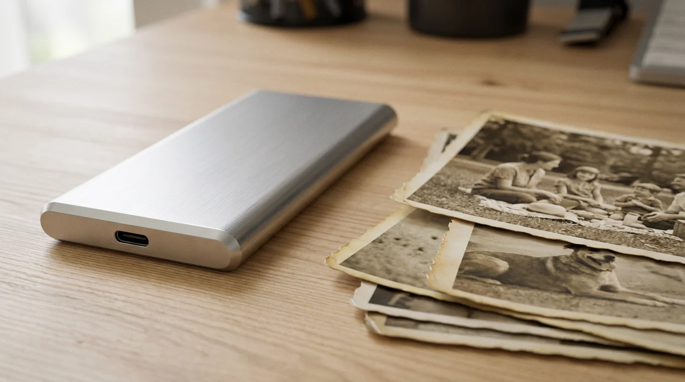
2. Implement a Robust Backup Strategy:
Digital files are vulnerable to hardware failure, accidental deletion, and cyber threats. A comprehensive backup strategy is essential.
- The 3-2-1 Rule: This widely recommended strategy ensures robust protection:
- Keep at least **3 copies** of your important data.
- Store these copies on at least **2 different types of media** (e.g., internal hard drive, external hard drive, cloud storage).
- Keep **1 copy offsite** (e.g., cloud storage, or an external drive stored at a friend’s house or safety deposit box).
- External Hard Drives: Use high-quality external hard drives specifically for backups. Consider drives with built-in RAID functionality for added redundancy.
- Cloud Storage: Services like Google Drive, Dropbox, OneDrive, Amazon Photos, or specialized archival services provide offsite storage and often offer versioning.
- Regularity: Automate cloud backups if possible. Perform manual backups to external drives weekly or monthly, especially after significant color correction projects.
The Image Permanence Institute offers excellent resources on digital image preservation, providing detailed guidance on best practices for long-term storage of your digital assets.
3. Organize Your Digital Collection:
A well-organized collection is easier to manage and ensures you can always find your `color restoration` efforts.
- Consistent Naming Conventions: Develop a logical file naming system (e.g., `YYYYMMDD_Event_Description_FamilyName_001.tiff`).
- Folder Structure: Create a clear, hierarchical folder structure (e.g., `Family Photos > Smith Family > 1950s > Vacations > [Specific Vacation]`).
- Metadata: Embed metadata (information about the image, like date, location, subjects, keywords) directly into your image files. Use IPTC/XMP fields for comprehensive data. This makes your photos searchable even if moved from their original folder structure.
By diligently following these preservation steps, you ensure that the time and effort you invest in `color correction scanning` translates into a lasting legacy of beautiful, accessible memories for future generations.
Frequently Asked Questions
How often should I back up my color-corrected digital photos?
Regular backups are crucial. Implement a 3-2-1 backup strategy: keep three copies of your data, store two copies on different types of media (like an external hard drive and cloud storage), and keep one copy offsite. Automate cloud backups if possible, and perform manual backups to external drives monthly or whenever you complete a significant batch of color correction work.
Can I perform color correction on my smartphone?
Yes, many mobile photo editing apps offer robust color correction tools. Apps like Snapseed, Adobe Lightroom Mobile, and others provide excellent features for adjusting white balance, exposure, contrast, and even selective color. While dedicated desktop software offers more precision, mobile apps are highly capable for quick adjustments and achieving good results on the go.
What is the biggest mistake people make when trying to fix colors on old photos?
The most common mistake is over-editing or making adjustments too aggressively. This often leads to unnatural colors, blown-out highlights, or crushed shadows. Approach color correction with subtlety. Make small, incremental changes and constantly compare your adjustments to the original scan. Aim for a natural, authentic look rather than a dramatically altered image.
Is it better to scan photos in color even if they are black and white?
Always scan black and white photographs in color mode. While counterintuitive, scanning in color (typically 24-bit RGB) captures a wider range of tonal information and allows for more precise control during post-processing. You can then convert the image to true grayscale in your editing software, leveraging the richer data for better contrast and detail retention.
How do I know when I have completed sufficient color restoration?
You achieve sufficient color restoration when the image looks natural, and the colors accurately reflect what you believe they looked like originally, or at least present a pleasing and authentic appearance. Avoid pushing colors to extreme saturation or contrast levels. Use reference images if available, and trust your eye. Step away from the image for a while, then return to it with fresh eyes. Often, less is more in achieving a believable and impactful restoration.
Disclaimer: This article is for informational purposes only. When handling valuable or irreplaceable photographs, consider consulting a professional conservator. Always test preservation methods on non-valuable items first.


Leave a Reply