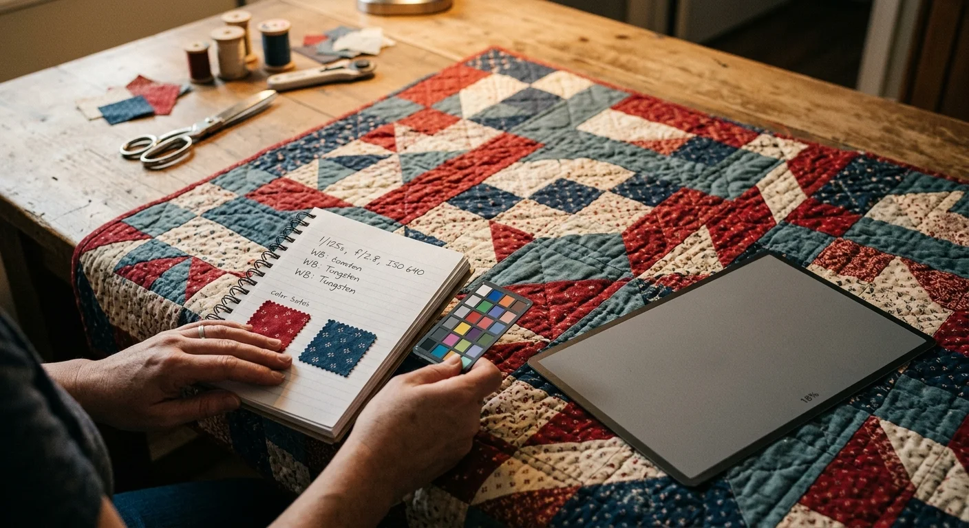
Photographing your handmade quilt under typical living room lamps often transforms vibrant ruby cottons and delicate teals into muddy, brownish swatches. You can capture quilt photography accurate colors at home without buying thousand-dollar studio strobes.
Most guides advise setting a custom white balance with an 18% neutral gray card, but standard 2700K domestic LEDs contain severe spectral dropouts that simple gray card neutralizations cannot mathematically repair.
To calibrate white balance fabrics accurately, you must pair gray target sampling with specific manual Kelvin and tint offsets in your camera software to offset the missing wavelengths in household lighting.
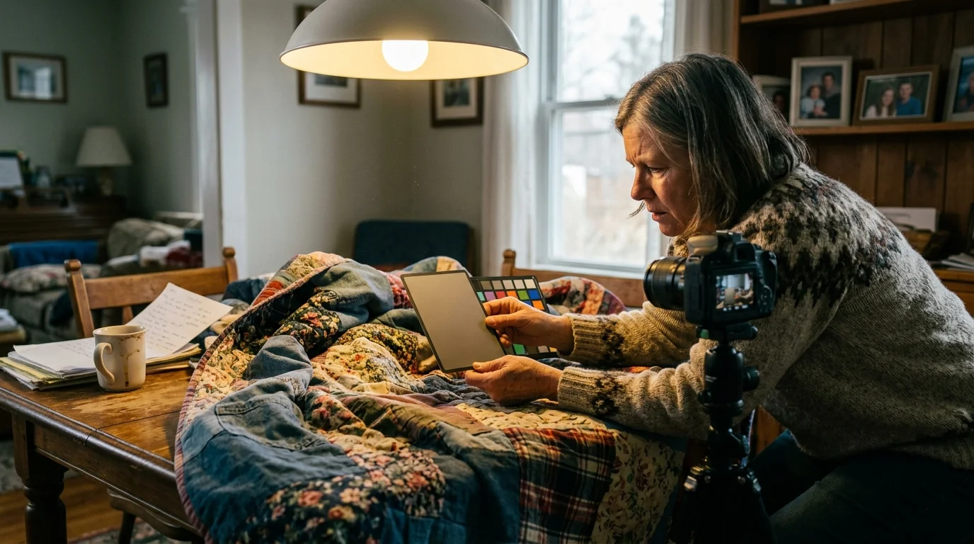
The Spectral Shortfall of Domestic 2700K LED Bulbs
Domestic LED bulbs rely on a blue diode coated with yellow phosphor to simulate warm white illumination. This engineering shortcut creates an intense spike at 450 nanometers followed by an uneven emission across green and red bands.
Standard residential lighting legally requires only a baseline Color Rendering Index (CRI) of 80 under European Union Ecodesign Regulation 2019/2020. In North America outside California, basic retail bulbs operate under similar baseline tolerances.
A CRI score measures general fidelity across eight pastel reference colors (R1 through R8). However, it completely ignores saturated tones like deep red.
Saturated red performance is tracked by the R9 metric. In conventional 80-CRI domestic bulbs, the R9 score often falls between 0 and 15, occasionally dropping into negative numbers.
California Title 24 Joint Appendix 8 mandates a minimum CRI of 90 and an R9 score of 50 for compliant residential installations. Most living room lamps outside California fall far below this standard.
Household bulbs also exhibit a severe spectral emission dip in the cyan wavelength band near 480 nanometers. This trough deprives your camera sensor of critical blue-green light reflected from turquoise, aqua, and slate fabrics.
If an LED bulb emits almost no light at 660 nanometers, a red dyed fabric cannot reflect that wavelength back into your camera lens. The camera cannot record photons that never existed in the room.
For a deeper breakdown of spectral power distributions and color science, review Cambridge in Colour to see how missing wavelengths skew digital image sensors.
Software balance tools multiply digital channels to adjust overall tone. When a light source lacks red wavelengths, multiplying that empty channel amplifies digital image noise rather than genuine fabric color.
This limitation explains why your hand-dyed crimson calico turns rust brown on screen. No automated camera profile can conjure light out of a physical vacuum.
Why White Paper Fails: The Physics of 18 Percent Neutral Gray
Many quilters attempt to calibrate their shots by placing a sheet of white printer paper or an index card over their quilt block. This common shortcut corrupts your color baseline.
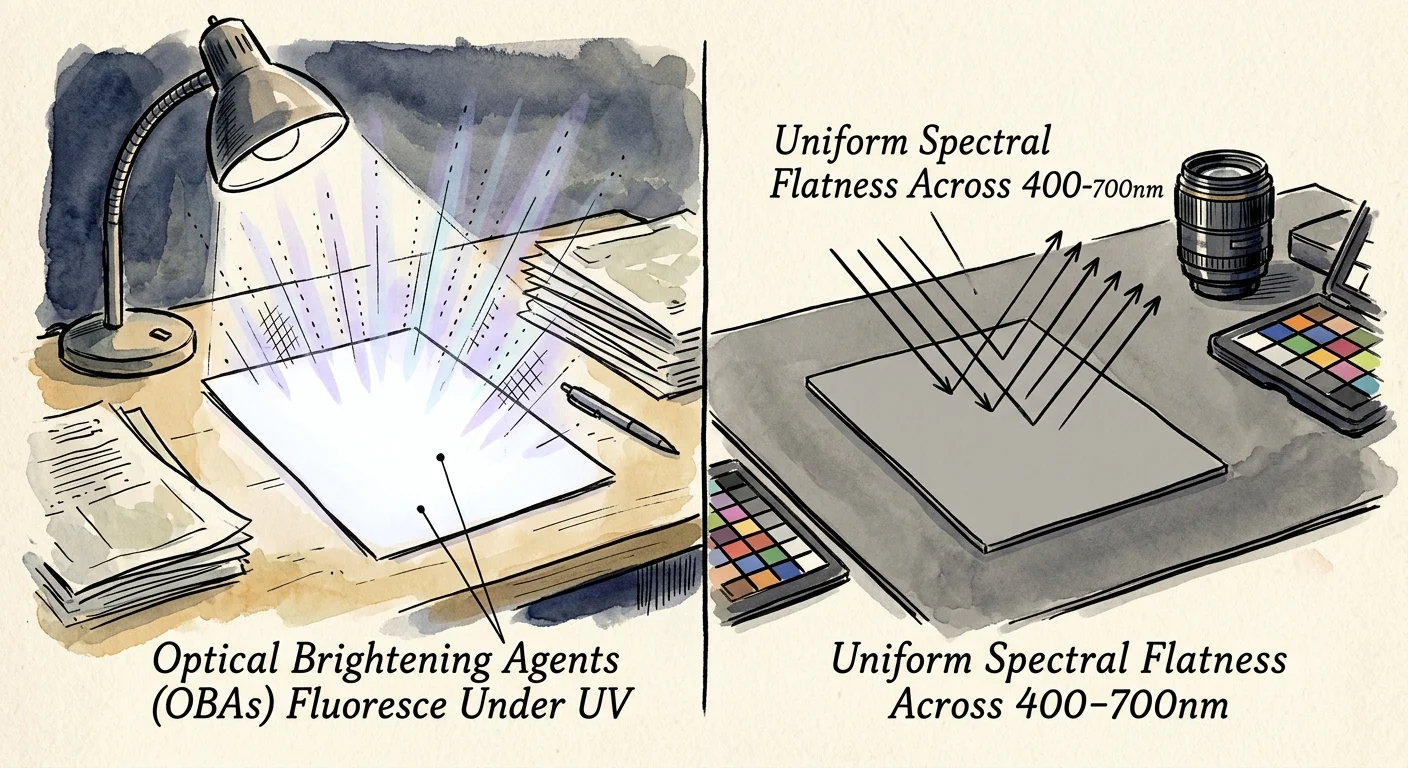
Standard copy paper contains Optical Brightening Agents designed to make paper look clean and bright. These chemical additives absorb invisible ultraviolet energy and re-emit it as visible blue light.
When your smartphone camera reads an optical-brightener-treated white card under domestic light, it detects false blue luminance. The software compensates by warming the frame, shifting your entire quilt toward a sickly yellow-orange cast.
Printer paper also reflects roughly 80 to 90 percent of incoming light. In contrast, photographic metering systems and digital sensors calibrate exposure against an 18 percent reflectance baseline.
A true photographic gray card reflects exactly 18 percent of visible light evenly across the entire spectrum from 400 to 700 nanometers. This flat spectral response prevents unwanted color skewing.
In July 2021, Calibrite assumed the manufacturing and distribution of former X-Rite photographic calibration tools. Their reference targets maintain tight spectral neutrality tolerances that office paper cannot deliver.
A certified gray card provides an unbiased target for the three color channels in your camera sensor. It forces red, green, and blue values to register at identical digital levels.
When you use a gray card indoor lighting reference, you establish a known physical standard. You eliminate the deceptive fluorescent glow produced by household paper products.
A spectrally flat 18 percent gray card reflects all visible wavelengths equally. Using fluorescent white paper introduces artificial blue spikes that corrupt your color balance.
Relying on genuine calibration targets ensures your fabric documentation starts from an objective foundation. It protects the integrity of your archival quilt records.
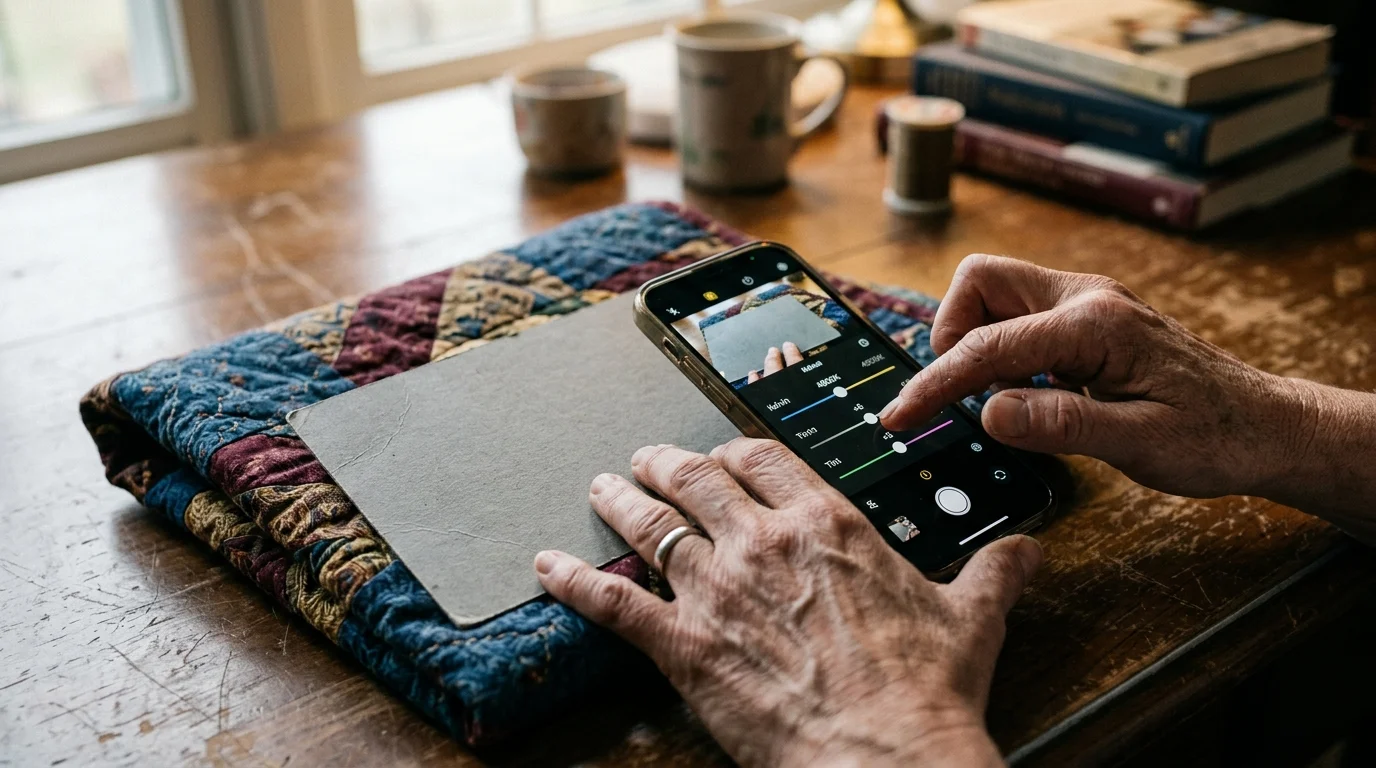
Manual Camera Setup: Dialing Kelvin and Tint in Mobile Apps
Smartphone automatic white balance algorithms continuously guess color temperature based on dominant hues in the frame. If your quilt features large fields of cobalt blue, the camera shifts warm.
Conversely, photographing a quilt dominated by warm cheddar yellows causes automatic white balance to overcool the image. This automated shift destroys color consistency across multiple photographs of the same textile.
To achieve consistent results, download a mobile camera app offering manual control, such as Halide, ProCam, or Adobe Lightroom Mobile. These apps allow manual Kelvin and tint locking.
Set your capture format to RAW or DNG instead of JPEG. RAW captures uncompressed 12-bit or 14-bit sensor data, preserving subtle color nuances that 8-bit JPEG compression discards.
Position your 18 percent gray card flat against the center of the quilt surface. Ensure the card catches the exact same room lighting illuminating the surrounding fabric blocks.
Use the manual white balance eyedropper tool within your app to sample the gray card surface. The app will calculate a baseline Kelvin temperature and tint coordinate.
Under standard 2700K domestic LEDs, the raw eyedropper reading usually selects a color temperature between 2600K and 2750K. However, low-CRI spectrum deficits require deliberate manual corrections.
Domestic LEDs carry a green-tinted phosphor signature. Manually adjust your tint slider toward magenta by +4 to +8 points to neutralize this sickly green cast.
Nudge your Kelvin value approximately 100K to 150K higher than the eyedropper baseline reading. This slight warmth injection restores visual body to red and yellow cotton fibers starved of light.
Lock these manual parameters before removing the gray card from the frame. Keep these exact settings fixed for all subsequent overall and close-up detail shots of that quilt.
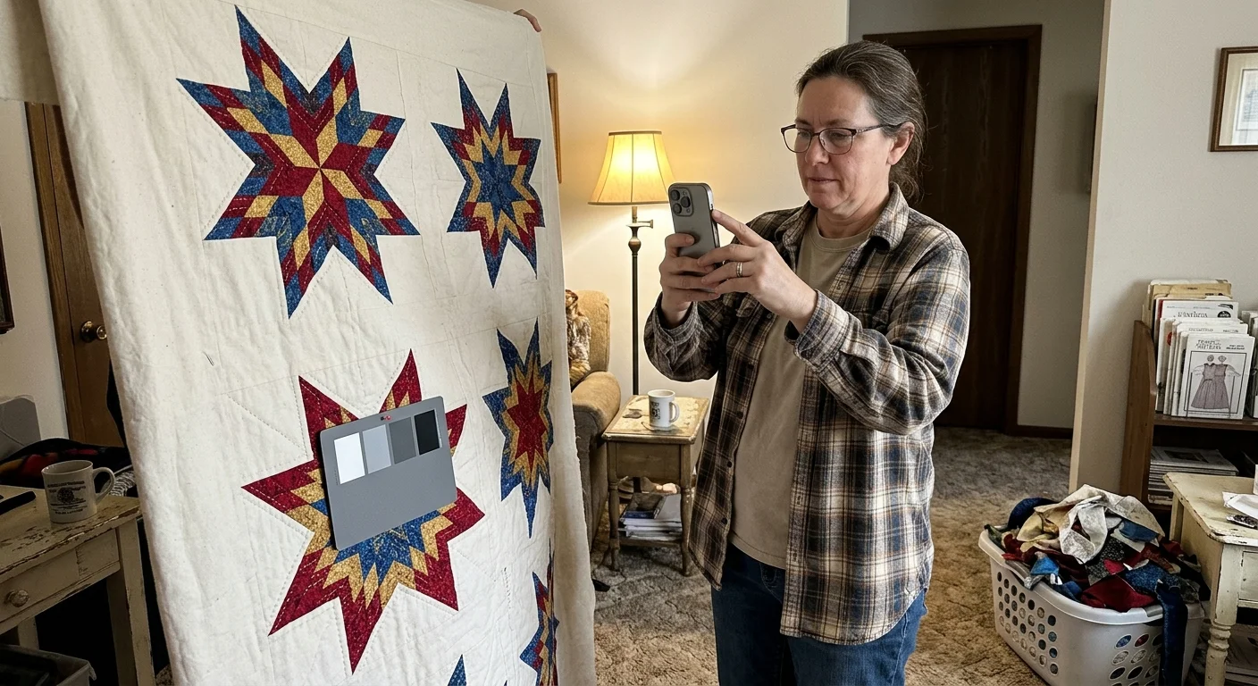
Worked Calibration Scenario: Documenting an Heirloom Star Quilt
Consider a worked scenario documenting a vintage Lone Star quilt measuring 72 by 72 inches. The textile features complex diamond patchwork in Turkey red, pine green calico, mustard yellow, and unbleached muslin.
The documentation takes place in an ordinary living room on October 14, 2024. Lighting comes from two 9-watt domestic LED floor lamps, each rated at 2700K, 800 lumens, and 80 CRI ($3.50 per bulb).
In this scenario, we use a Calibrite ColorChecker Gray Balance card ($25 USD, 4×7 inches) and a smartphone running the Adobe Lightroom Mobile camera interface.
First, pin the quilt smoothly against a neutral wall. Position both floor lamps four feet away from the textile at 45-degree angles to produce even, cross-directional coverage.
An initial test shot under automatic white balance yields an errant reading of 3150K with a +14 magenta tint. The reds appear rusty orange, and the muslin background turns dull gray.
Next, rest the 4×7-inch gray balance card against the central star medallion. Switch the mobile app to manual capture mode in DNG format.
Tap the white balance eyedropper directly on the gray card target. The software calculates an initial reading of 2680K and a +4 tint.
The sampled gray card image looks cleaner, but the Turkey red diamonds still appear noticeably desaturated due to the low R9 emission of the household bulbs.
Apply a manual Kelvin offset: shift the color temperature slider from 2680K up to 2800K (+120K offset). Then, shift the tint from +4 to +8 toward magenta.
Remove the gray card while holding your smartphone on a sturdy tripod at quilt center height. Capture the master overall photograph at ISO 50 and 1/30 second.
Next, move in to photograph four close-up macro shots of the quilting stitch work and calico prints. Retain the identical 2800K and +8 tint settings.
The entire shooting process takes exactly 25 minutes. Comparing the digital DNG preview to the physical quilt under natural daylight reveals an accurate visual match across all fabric colors.
This worked calibration confirms that a modest Kelvin offset and tint boost successfully counteracts low-CRI spectral gaps. It preserves archival color accuracy without expensive equipment.
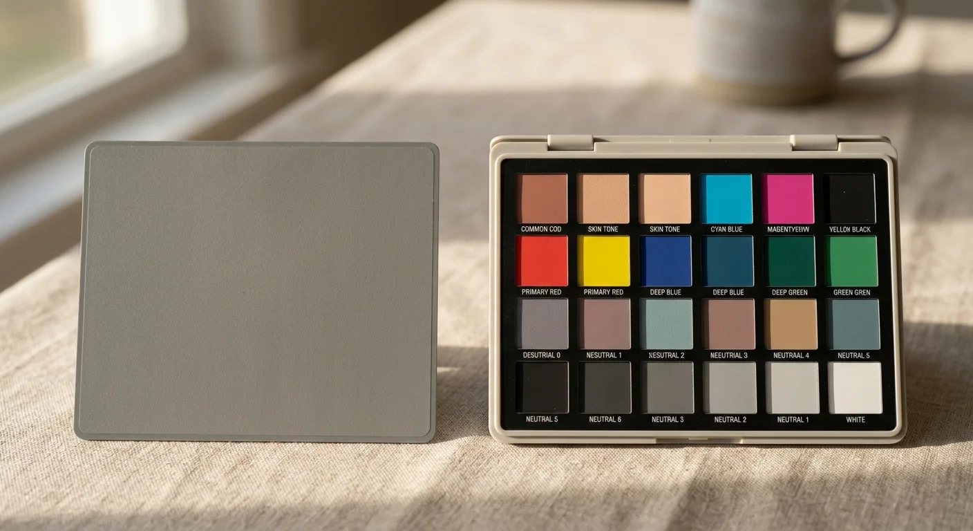
Hardware Comparison: Gray Cards Versus Full Color Targets
Choosing the right color balance target depends on your project goals and budget. Simple gray cards establish neutral white balance, whereas multi-patch targets generate complete camera profiles.
Standard gray cards correct global color temperature, but they cannot selectively adjust individual color channels. Full color targets allow software to construct customized color profiles that correct specific spectral deficiencies.
The following table contrasts standard physical reference tools used to calibrate white balance fabrics under domestic lighting environments.
| Reference Tool | Target Reflectance | Spectral Neutrality (400–700 nm) | Optical Brighteners | Profiling Capability | Retail Price (USD) |
|---|---|---|---|---|---|
| Calibrite ColorChecker Passport Photo 2 | 18% Gray + 24 Color Patches | Within ±1.5% | Zero (OBA Free) | Full DNG / ICC Camera Profiles | $119 |
| Calibrite ColorChecker Gray Balance | 18% Neutral Gray Target | Within ±2.0% | Zero (OBA Free) | Global Neutral Balance Only | $25 |
| WhiBal G7 Pocket Card | 18% Neutral Gray Target | Within ±1.0% | Zero (OBA Free) | Global Neutral Balance Only | $32 |
| Standard 20lb Copy Paper (Control) | 88% to 92% White Surface | Uneven (Blue Peak at 440nm) | High Concentration | None (Introduces Color Skew) | $0.02 |
For basic textile documentation, a $25 to $32 standalone gray card satisfies everyday cataloging needs. It gives you the baseline necessary for manual Kelvin offsets.
If you document rare antique quilts or sell high-end textile art, invest in a 24-patch target kit like the Calibrite Passport. The custom software profiles correct individual color channel troughs.
While an 18 percent gray card balances exposure and temperature, a 24-patch target builds custom color profiles that digitally compensate for an LED bulb’s low saturated red output.
Even the most advanced target kit cannot conjure light wavelengths that are physically missing from the room. Hardware selection must pair with smart ambient lighting choices.
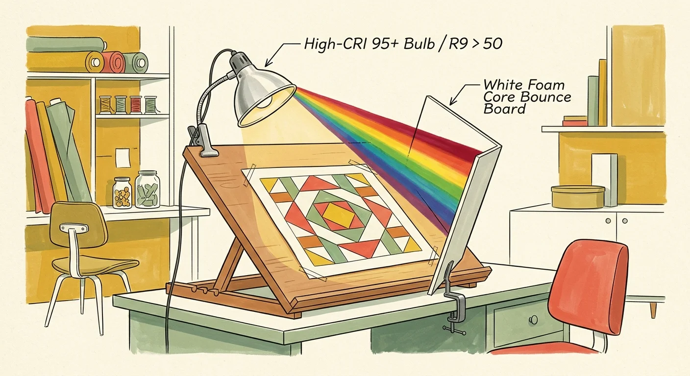
Low-Cost Lighting Adjustments to Fix Missing Red Spectra
When photographing textiles at home, modifying your light source produces far better images than relying entirely on post-capture software fixes. Hardware upgrades can be surprisingly affordable.
You do not need commercial photography strobes to achieve professional color rendering. Simply replacing standard 80-CRI living room bulbs with high-CRI domestic screw-in LEDs transforms your capture quality.
High-CRI domestic LED bulbs achieve a CRI of 95 or higher and an R9 score greater than 80. Brands such as Waveform Lighting and Philips Ultra Definition retail for $7 to $20 USD per bulb.
Installing these high-CRI bulbs into your standard household lamps eliminates the 480-nanometer cyan gap. They also flood your fabrics with rich 660-nanometer deep red light.
Professional archival institutions emphasize non-destructive and true-to-life visual documentation practices. Review the textile and object standards at the Library of Congress Preservation Directorate for institutional guidelines on documenting heritage artifacts.
When arranging your lamps, position two matching light fixtures on opposite sides of your quilt at 45-degree angles. This cross-lighting arrangement eliminates specular glare and renders stitching texture with balanced clarity.
Never mix daylight from an open window with 2700K domestic lamps during a photography session. Mixed color temperatures create uneven color casts across your quilt that no gray card can balance.
Close all window blinds and switch off overhead fixtures before calibrating your manual settings. Isolating your quilt under consistent, high-CRI illumination guarantees repeatable and faithful color results every time.
By controlling your ambient spectrum and mastering gray target calibration, your quilt photography accurate colors will faithfully reflect your craftsmanship. Your digital archives will preserve your textile legacy accurately for future generations.
Frequently Asked Questions
Can I use an 18 percent gray card in post-processing if I forget to calibrate during capture?
Yes, as long as you capture a test shot containing the gray card under identical lighting conditions before moving your lamps. In software, click the white balance eyedropper on the card.
However, shooting in RAW or DNG format is mandatory for post-capture corrections. 8-bit JPEG files discard critical color data, preventing accurate recovery of shifted tones.
Why does my red fabric look brown even after gray card balancing?
Your domestic LED bulbs likely possess an R9 color rendering rating below 20. If the light source emits minimal red wavelengths, your fabric cannot reflect them back to the sensor.
To correct this, apply a slight positive Kelvin offset (+100K to +150K) and magenta tint adjustment, or upgrade to 95+ CRI domestic LED bulbs.
How far should my gray card be from the quilt when setting white balance?
Hold or pin the gray card directly against the quilt surface in the center of the illuminated area. It must receive the exact same light angle and intensity as your fabric.
Angle the card slightly away from direct reflections to prevent glare, ensuring the camera sensor meters purely diffuse light.
Does the size of the gray card matter for mobile quilt photography?
Card size does not alter color balance accuracy, but larger cards are easier to target with mobile camera apps. A 4×7-inch card allows effortless spot sampling from normal shooting distances.
Pocket-sized cards measuring 2×3 inches work effectively if you bring the camera close to lock settings before stepping back for the full quilt composition.
Disclaimer: This article is for informational purposes only; consult a professional conservator when handling valuable textiles or heirloom photographs. Always test documentation methods on non-valuable items first.