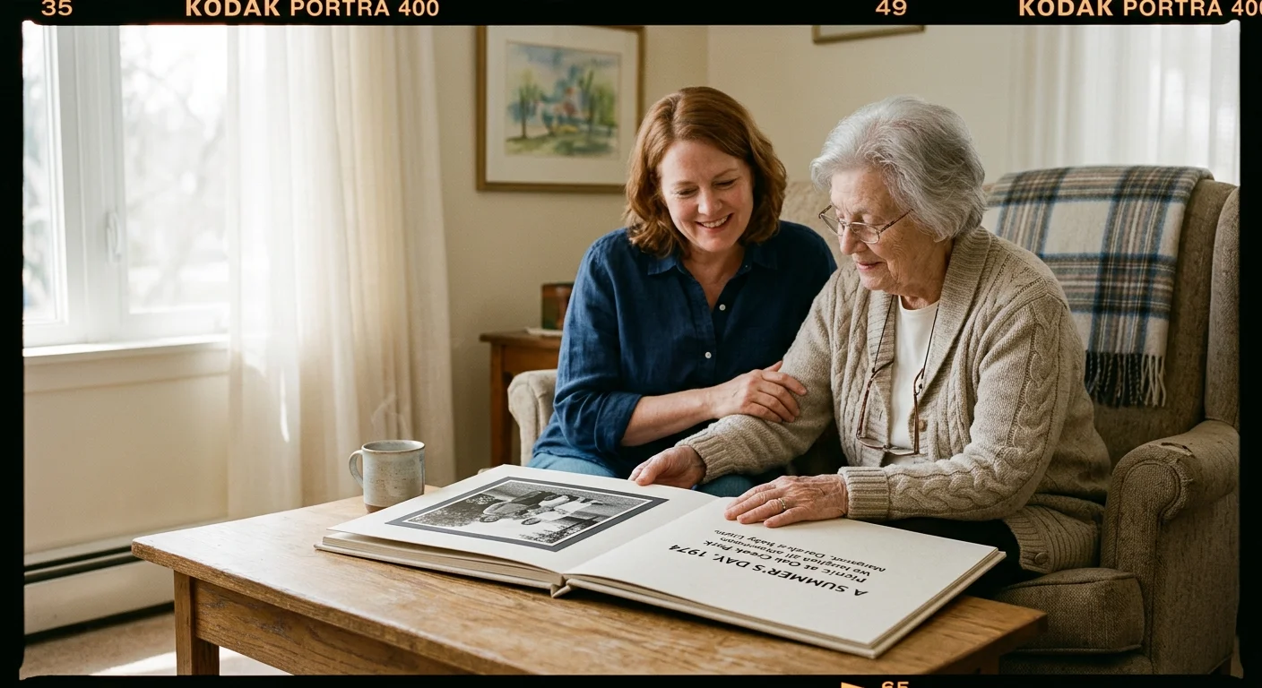
You can transform your grandmother’s treasured memories into daily comfort, even as Alzheimer’s alters how her brain processes visual information. This custom tactile memory album helps ground her during your visits to her care facility.
While exploring creative photo book formats is common for vacations and milestones, designing for memory loss demands an entirely functional, clinical approach.
Much like compiling a life-story legacy book for aging parents, adapting your layout to cognitive needs fosters comfort and meaningful connection.
Standard commercially printed albums fail residents because harsh institutional lighting turns glossy pages into disorienting mirrors that trigger anxiety and visual confusion.
Building an album with non-glare matte finishes, bold 18-point sans-serif type, and isolated high-contrast borders anchors her autobiographical recall against progressive cortical visual loss.
Understanding Cortical Visual Decline and Glare Sensitivity
Alzheimer’s disease damages more than hippocampal recall; it directly impairs the primary visual cortex and association pathways. The brain loses its capacity to translate raw optical input into coherent environmental comprehension.
According to the Alzheimer’s Association, an estimated 7.4 million Americans aged 65 and older live with this diagnosis. Each individual experiences progressive sensory degradation alongside cognitive changes.
As the condition advances, your grandmother faces severe drops in contrast sensitivity, spatial depth perception, and edge differentiation. Colors with similar tonal values bleed together into an indistinguishable field.
The eye’s natural crystalline lens also yellows with age, filtering out short-wavelength light and muting blues and greens. This physiological shift compounds the brain’s neurological struggle to distinguish boundaries.
Overhead fluorescent tubes in residential memory care facilities make these challenges worse. Unshielded institutional lighting strikes smooth surfaces and creates intense, blinding hot spots.
Clinical dementia studies reveal that visual agnosia frequently causes residents to misinterpret specular reflections as standing water or physical voids. A shiny page surface appears wet or broken rather than flat.
When your grandmother pushes a glossy album away, she is defending herself against perceived danger. You eliminate this distress by designing for her specific neurological reality.
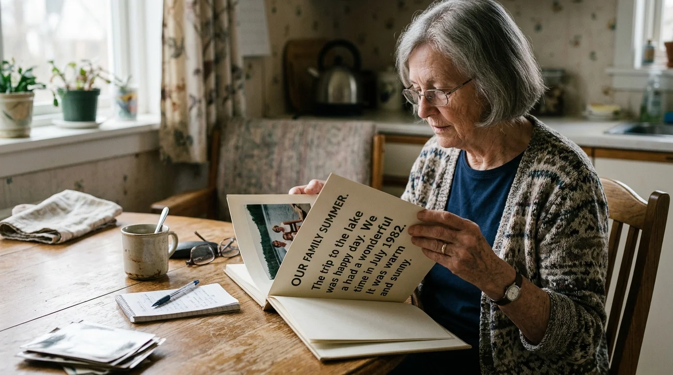
Typography Standards: Font Sizing, Leading, and Phrasing
Legibility requires strict adherence to evidence-based typographic hierarchy. Guidelines from the Dementia Engagement and Empowerment Project advise against decorative or condensed fonts that crowd letterforms together.
Trimming an overwhelming collection down to only the most recognizable life events mirrors the discipline needed when curating inherited photo collections to prevent clutter.
Arranging these captions chronologically can support reminiscence by creating a family photo timeline that guides your loved one smoothly across life stages.
For an assisted living memory album, set your body copy between 18 and 20 points. Format section headers between 24 and 28 points to ensure immediate readability.
Choose clean, unadorned sans-serif typefaces like Arial, Helvetica, or Verdana. These typefaces feature open counters and distinct character shapes that prevent confusing similar letters like “e,” “c,” and “o.”
Set line spacing to an expanded 1.5 line height. Generous vertical leading stops adjacent lines of type from merging into dark bands in her peripheral field.
Always align your captions flush left and ragged right. Centered or justified text forces impaired eyes to locate irregular starting coordinates on every line, which induces rapid visual fatigue.
Speech-language pathology researcher Dr. Michelle Bourgeois established that declarative phrasing directly improves conversational engagement for individuals with dementia. Text should provide immediate answers rather than demand recall.
Format captions as simple, first-person declarative sentences, such as: “This is my brother, Thomas.” This structure validates your grandmother’s identity without testing her memory.
Never write interrogative captions like “Do you remember your high school graduation?” These open questions create instant performance anxiety, causing the resident to withdraw into silence.
Evidence-based memory aids replace cognitive recall tests with supportive factual statements, preserving dignity and conversational flow during visitation.
Engineering High-Contrast Page Layouts to Counter Visual Crowding
Visual crowding occurs when neighboring images and decorative elements overwhelm the brain’s damaged spatial processing center. Crowded layouts turn family photos into an undecipherable collage.
If you plan to incorporate historical clippings alongside family pictures, take time to learn about preserving newspaper clippings and memorabilia so acidic paper doesn’t bleed through adjacent leaves.
If you are sorting through uncaptioned photos from her early adulthood, dating unlabeled mid-century prints by vehicle trim and fashion details can help you place them in the correct era.
Standard commercial albums often cram five or six pictures onto a single page. For a dementia patient, that visual density triggers immediate sensory overload.
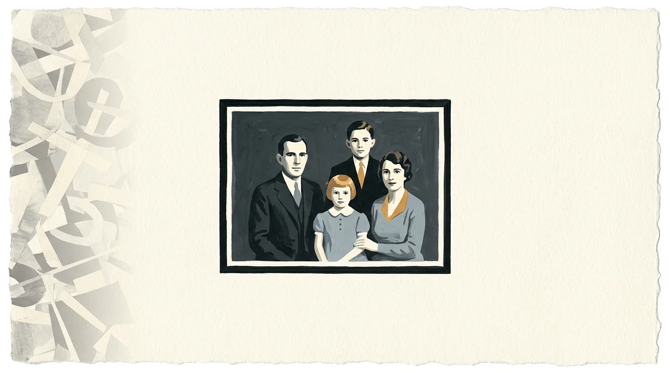
Restrict every page spread strictly to one focal photograph paired with one supporting declarative caption. Surrounding white space gives the visual cortex time to process the focal subject without competition.
Designing high contrast photos for elderly viewers requires exceeding standard consumer print thresholds. You should target a contrast ratio of at least 7:1 between visual elements and their backgrounds.
True black text printed on a clean, off-white background delivers a functional contrast ratio close to 20:1. This maximum luminance separation ensures effortless reading under dim evening facility lighting.
Frame every vintage photograph with a crisp, 3-millimeter solid black border. This dark perimeter functions as an optical fence that defines where the picture stops and the blank page begins.
When preparing aged snapshots, use photo editing software to elevate midtone contrast curves. Deepen washed-out blacks and brighten muddy highlights to compensate for her reduced contrast sensitivity.
Sharpen the contours around human faces and expressive eyes. Enhancing these focal points guides her gaze directly to familiar features, accelerating emotional recognition.
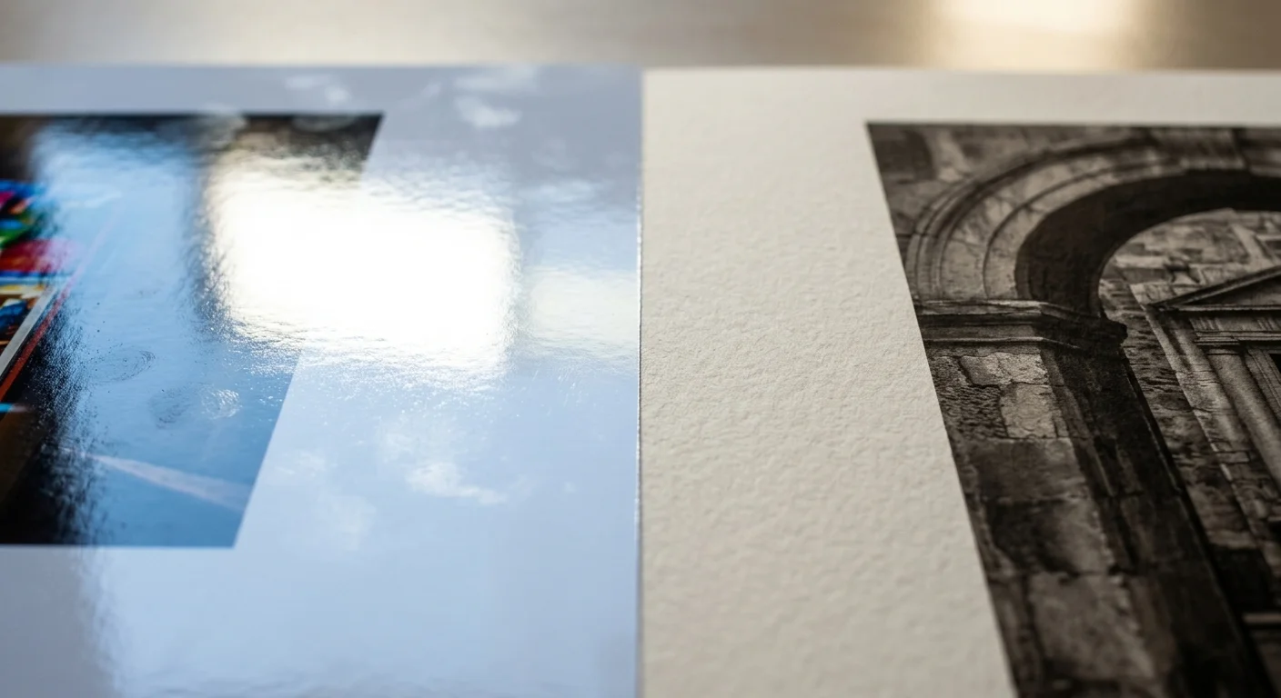
Substrate Selection: Eliminating Facility Glare with Deep Matte Finishes
Your paper substrate directly governs whether the memory book invites connection or causes defensive avoidance. Commercial gloss coatings reflect ambient bulbs directly into the viewer’s eyes.
Selecting museum-grade, chemical-free papers also helps stop photo fading over time, protecting your reproduction prints from environmental deterioration.
Clear vinyl adhesive sleeves and plastic pocket pages cause the same visual interference. Plastic sleeves also trap humidity and produce distorted optical ripples across original prints.
You can examine preservation standards from the Library of Congress Preservation directorate to understand how stable, acid-free substrates preserve photographic media over decades.
Print your album on a heavyweight, true fine art matte cotton rag paper. Deep matte surfaces disperse incoming rays evenly, eliminating specular highlights regardless of room lighting angles.
Specify a paper weight between 250 and 300 grams per square meter (gsm). Heavyweight stock prevents distracting image show-through from the reverse side of the leaf.
Thick paper leaves also offer vital mechanical stiffness. Fragile, paper-thin sheets frustrate hands affected by arthritis or tremors, while stiff sheets turn easily without tearing.
A soft-touch or velvet matte protective laminate offers an excellent alternative for facility environments. This protective barrier repels water, resists fingerprints, and withstands routine sanitizing wipes.

Worked Example: Specifications, Costs, and Layout for a 20-Page Facility Album
Here is an actionable production plan for building an 8.5-by-8.5-inch hardbound memory book tailored to assisted living environments. This compact square profile rests comfortably on a lap or wheelchair tray.
If your prints are scattered across multiple storage boxes or bedrooms, try organizing physical photo prints methodically before deciding on the final twenty images.
If your chosen prints are currently stuck in older scrapbooks, learn how to scan and preserve old photo albums page by page before attempting extraction.
Begin by selecting exactly 20 foundational photographs from your family archives. Digitize each print on a flatbed scanner at 600 DPI, saving the raw captures as uncompressed TIFF files.
Open each image in your digital editing workspace and raise midtone contrast values by 15 percent. Crop out background clutter to emphasize the primary subject’s face.
Import your edited scans into an 8.5-by-8.5-inch layflat album template. Place one 5-by-5-inch photo on the right-hand leaf of each spread, centered with a 3-millimeter black border stroke.
Position an 18-point Arial caption box 0.75 inches below the photograph. Type a single declarative sentence in true black ink, such as: “My wedding day with Henry in June 1958.”
Select a 300 gsm fine art matte paper stock paired with a durable layflat binding. Professional short-run digital photo printers charge $54.00 for this 20-page specification.
Add a durable, textured slate-gray buckram cloth cover with foil-stamped lettering for $12.00 extra. The physical text on the front cover should state her full name clearly: “Margaret Jenkins: My Life Story.”
Scanning and digital page layout require roughly 3.5 hours of focused effort. This $66.00 investment yields a resilient, glare-free keepsake that supports daily reminiscence.
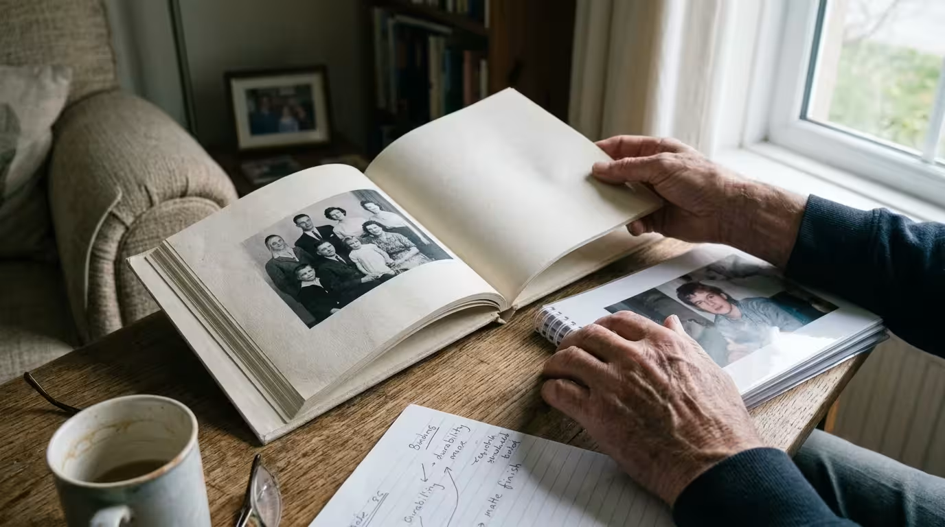
Substrate and Binding Comparison for Care Facility Durability
A dementia memory album must survive heavy physical wear, accidental beverage spills, and institutional handling. Evaluating paper finishes and structural bindings ensures long-term utility.
These durable laminates and layflat bindings mirror the techniques used when designing a spill-resistant heritage cookbook to withstand heavy handling and daily accidents.
The following comparison details how different material combinations hold up inside residential care environments.
| Substrate & Binding Type | Specular Reflectance (Glare) | Tactile Grip & Turning | Facility Durability | Estimated Cost (20 Pages) |
|---|---|---|---|---|
| Gloss Coated / Plastic Sleeves | 85% – 92% (Severe glare hazard) | Poor; slippery plastic slides out of hands | Low; sleeve seams split, pages fall out | $28.00 |
| Luster Semi-Gloss / Perfect Bound | 35% – 45% (Moderate hot spots) | Fair; thin 170 gsm sheets curl easily | Medium; spine breaks if book is forced flat | $36.00 |
| Cotton Rag Matte / Layflat Hinge | 2% – 4% (Zero glare distortion) | Excellent; fibrous texture assists grip | High; opens flat without creasing spine | $54.00 |
| Velvet Laminate Board Book | 3% – 5% (Diffused reflection) | Outstanding; 1.2 mm thick rigid boards | Maximum; completely wipeable and drop-proof | $62.00 |
Layflat binding is essential because traditional glued book gutters swallow the inside margins of images. A book that springs shut frustrates a reader with limited finger strength.
Layflat construction ensures the volume rests open on a bedside table without intervention. Your grandmother can study the photographs at her own pace without wrestling the spine.
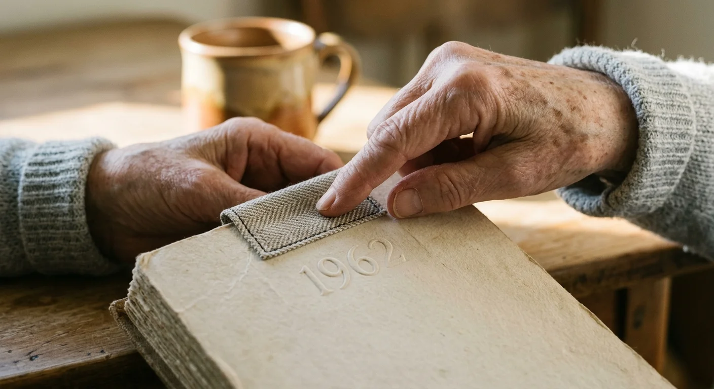
Tactile Cues and Sensory Anchors for Interactive Reminiscence
Tactile pathways often remain functional long after verbal processing deteriorates. Integrating multi-sensory accents into the memory album reopens non-verbal routes to autobiographical recall.
When handling rare family keepsakes, review best practices from the American Institute for Conservation. Using reversible techniques ensures historical treasures remain protected for future generations.
Fasten small fabric remnants beside relevant photographs using archival mounting corners. Place a small swatch of lace beside her bridal portrait, or a square of wool beside her favorite winter coat.
Touching these textured materials prompts spontaneous sensory recall. Physical textures stimulate somatosensory circuits, sparking conversations when flat visual prints fail to register.
Affix heavy, laminated index tabs along the outer right margins of key sections. Tabs divide the book into distinct life chapters, such as “Early Years,” “Family,” and “My Garden.”
These physical projections allow arthritic hands to navigate directly to favorite pages. They turn page manipulation from an embarrassing struggle into an effortless motor action.
Select a woven linen or buckram fabric for the outer album cover. Natural woven textures offer sensory warmth, making the book comforting to hold across her lap.
Sensory memory often persists through mid and late-stage cognitive decline, providing an emotional doorway when semantic vocabulary begins to fade.

Curating and Sequencing the Narrative Across Cognitive Stages
Effective alzheimers memory album design relies on ruthless curation rather than exhaustive family archiving. Paring down the collection to essential moments prevents decision fatigue and visual confusion.
Cognitive psychology highlights the reminiscence bump: older adults retain vivid memories formed between the ages of 10 and 30 longest. Prioritize images from this formative window.
Feature photographs of her childhood home, early career achievements, engagement, and youthful celebrations. These remote memories withstand neurological degradation far longer than recent events.
When including modern photographs of yourself or great-grandchildren, employ a visual bridge. Place your current portrait directly beside a photo of yourself as a child at that age.
This side-by-side comparison resolves temporal confusion. Her mind may expect a school-aged child rather than an adult, and pairing images bridges that gap.
Select photographs that feature exaggerated, joyful facial expressions. High-expression portraits clearly communicate positive emotion, helping the viewer interpret the mood of the scene.
Address deceased loved ones with care and dignity. Avoid placing black mourning ribbons or death dates on pages, as these markers can trigger fresh grief cycles upon every reading.
Instead, celebrate the relationship with life-affirming declarative captions: “Henry was my devoted husband for fifty years.” This framing honors their bond while reinforcing security and love.
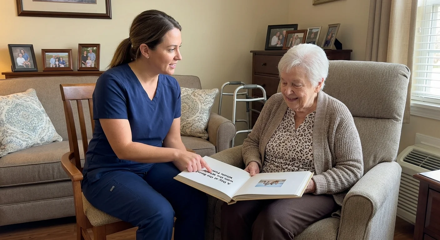
Staff Collaboration: Turning the Memory Album into a Daily Care Tool
A well-constructed photo book for dementia patient care serves as an invaluable bridge between residents and professional staff. Certified nursing assistants face demanding schedules and rotate shifts frequently.
A prominent, highly legible album resting on your grandmother’s nightstand invites staff to view her as an individual with an accomplished history. It humanizes clinical care routines.
Include an introductory “About Me” spread on the inside front cover. Use 20-point bold type to highlight her preferred name, former profession, proudest achievements, and favorite music.
Provide brief instructions for visiting aides and nursing assistants. Suggest that caregivers point to the pictures, read captions aloud, and give her ample time to respond.
Staff can use these personalized cues to redirect agitation during morning routines. Looking at a calming picture of her childhood dog can de-escalate anxiety far better than verbal reasoning.
Your thoughtful layout choices protect her dignity and facilitate warm, person-centered interactions every single day.
Frequently Asked Questions
What is the best font size for an Alzheimer’s memory book?
Set body text between 18 and 20 points, and format section headings between 24 and 28 points. High-legibility sans-serif typefaces like Arial or Verdana ensure readable captions.
Why should I avoid glossy photo paper for a dementia album?
Harsh fluorescent facility lighting creates specular glare on glossy paper. Visual agnosia can cause a person with dementia to misinterpret reflections as standing water or physical holes.
How many photos should appear on each page?
Place exactly one focal photograph on each page spread. Multi-photo collages cause visual crowding and cognitive fatigue, making recognition difficult.
How can I protect delicate vintage family photos while building this album?
Digitize your delicate originals by scanning them at 600 DPI, and print high-quality reproductions on heavy matte cardstock. Store the vintage originals safely in acid-free archival enclosures.
Disclaimer: This article is for informational purposes only. When handling valuable or irreplaceable photographs, consider consulting a professional conservator. Always test preservation methods on non-valuable items first.